How to Make an Effective Business One-Pager (With Examples)
A one-pager is a resume for your business. It’s a short, distilled message that gives readers a quick overview of your business, product, open role, or event.
In the same way that a fine-tuned resume can help you win your dream job, a well-designed one-pager can help you win the hearts (and money) of customers.
In this article, we’ll explore the benefits and purpose of a one-pager. We’ll also show you several real-world one-pager examples—so that you leave inspired to create an effective one-pager of your own.
What is a one-pager?
Let’s begin with the basics. As the name suggests, a one-pager is a promotional or informative message that fits onto a single, one-sided page.
The most common purpose of a one-pager is to promote something like a business, product, feature, or event.
As a marketing tool, this single page can be used to highlight the various strengths of your business. The best one-pagers are skimmable and use a combination of written content along with graphics and careful formatting.
But one-pagers shouldn’t be created in a vacuum. Think of your one-pager as a resume. The most effective resumes are dynamic. A proactive job seeker may have several versions of their resume, which they use to target slightly different roles.
The audience impacts the message. In that same way, the key to writing an effective one-pager is first to determine your audience. (More on that later.)
The benefits of creating a one-pager
One-pagers have two primary purposes: to promote and to educate. Powerful one-pagers achieve both: using simple, clear communication to showcase the best elements of a business.
Here are several benefits of creating a one-pager:
Codify how you talk about the business: In many companies, every department—sometimes every individual—has their own way of describing the company. This can be confusing to people not on the inside (namely customers). With a one-pager, you can get everyone on your team on the same page about how to describe your business and offerings.
Equip your sales team: One of the key benefits of a one-pager is that it offers a product deep dive, without requiring much time or sacrifice from the reader. An effective one-pager is great for sales teams, which often need to provide prospects with a clear, fast overview of the benefits of the company.
Workshop your product descriptions: Great one-pagers use a combination of snappy headlines and short, descriptive copy. Once you’ve created a one-pager, you can use the same copy across other marketing collateral like your website or ads.
Publish and promote in multiple formats: A one-pager can be emailed as a PDF, downloaded from a website, printed and passed out at conferences, or simply published as an image on your blog or favorite social media website. They’re easy to publish and share, making it easy for your message to get in front of the right people.
Best practices for making an effective one-pager
Towards the bottom of this article, we’ve included a handful of one-pager examples for inspiration. But before we show you what a one-pager looks like, let’s dive into the core elements that the best one-pagers have in common.
Here are our guidelines for what to include in your one-pager.
1. Formula: One audience per one-pager
Before you begin crafting your one-pager, it’s important to consider your ideal reader. As the saying goes, if you try to appeal to everyone, your message will catch the attention of no one. It’s better to use a clear, focused message for a specific audience than to speak so generally that no one cares about your one-pager.
As a rough formula: target one audience per one-pager.
You can create multiple one-pagers for different audiences. A startup looking for funding, for example, may create several one-pagers to ensure their message is clear and relevant to each one. If the startup has multiple target customers, they can design individual one-pagers for each persona.
But the one-pagers don’t have to stop there.
The startup may also create a one-pager targeted to investors, giving them specific financial information that only prospective investors care about (e.g., market size, profit margins, and revenue). The dev team may have a one-pager that describes the technical specs of the product. This can be used for onboarding or as internal marketing to teach their own team about the product.
The startup may create a recruiting-style one-pager that showcases the benefits of working for that company. The list goes on.
2. Determine the most important information (then only use 20% of it)
Lean into the Pareto Principle here: use the 20% of information about your business that sparks 80% of the reader’s interest.
By eliminating the other 80% of information, you will keep your one-pager lean. You’ll also have ample white space so that your design doesn’t feel “busy.”
Focusing only on the top 20% of features and information also leaves space for reader curiosity. That’s because the most interested readers are sure to have questions. You want readers to feel hungry to learn more about your product or services. That’s when they’ll contact you or buy your product.
3. Test and adjust
The only way to confirm the effectiveness of your one-pager is to run it by members of your target audience. You can use paid services like UserTesting.com to have people go through the one-pager live with you. This can be a great way to determine if your copy and messaging are not only interesting, but also clear.
The other way to test your one-pager is to simply send it to your target customers. If you receive interest from people reading your one-pager, you may be onto something. If all you hear is crickets, that’s a good sign that you should take another stab at the one-pager.
4. Combine text with visual content
Your copywriter and designer should tag-team this project.
A good one-pager combines precise copy with informative graphics. A nice layout is also helpful. The designer can help organize the written content so that the most important information is easiest to find and read.
What to include in a one-pager
One-pagers can cover a vast range of topics from recruiting and investment prospecting to product marketing. Those are broad categories that require slightly different information. However, as a general rule, you should try to include the following information in your one-pager:
- The value of your product and its relevance to the reader: This is the essence of good copywriting. Where do the deepest needs of your readers overlap with the core benefits of your company or product? That’s the sort of information you should include in your one-pager.
- The foundational information: Provide dates for deadlines. Tell readers your rates. One of the key functions of a one-pager is to inform the reader. So whatever you want the reader to know, tell them.
- Just enough context: Give readers enough information to understand why your product is relevant to them, right now. But don’t overdo it. Your audience doesn’t need your entire backstory.
- Use social proof: This is how you’ll convey to the reader that other people love your product. Use numbers, reviews, logos—whatever it takes to communicate that there’s demand for whatever you’re selling.
- Include a call-to-action or contact information: Interested readers need a way to order your product, contact the sales team, or learn more about what you’re promoting. Give readers the information to take the next step.
Designing a one-pager
One-pagers can be simple. They can be complex. No matter where your one-pager falls on that spectrum, it should always include these three elements:
- Clear writing: How else will you get your message across? Clear writing is the ultimate marketing tool for a good one-pager. Relevant information, presented succinctly, is a recipe for good copy.
- Relevant visuals: What graphics and pictures can you use to enhance the message of your one-pager? As the saying goes, a picture is worth a thousand words. The best one-pagers communicate just as much through their visual presentation as they do through their words.
- White space: Just as important as knowing what to include in your one-pager is knowing what not to include. With too much information, your one-pager can easily begin to look like a wall of text. You don’t want your one-pager to resemble a high schooler’s exam cheat sheet. Keep it simple: A little white space goes a long way.
8 one-pager examples (based on use cases)
We’ve discussed the best practices for creating a one-pager. But instruction only gets you so far. Eventually, you need to see what a good one-pager looks like out there in the wild. Without further ado, here are several one-pager examples:
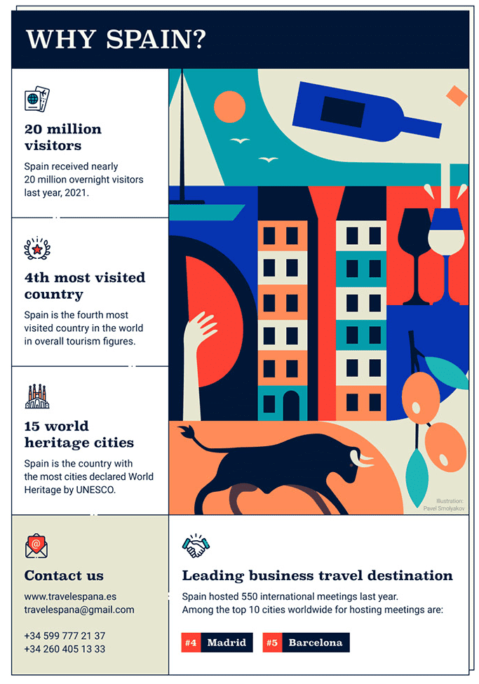
1. B2C one-pager example
Simplicity sells. We liked this B2C one-pager example because the designer leaned heavily into aesthetics. They used minimal copy and used most of the one-pager space to showcase a graphic. The value here is expressed visually. Copy enhances the graphics by providing social proof.
2. B2B one-pager example
Most one-pagers are designed to fit the average size of a sheet of paper. This makes them easy to print. But in the internet age, not every one-pager needs to be printed. Many are made purely to be shared and presented as PDFs. As a result, many companies push beyond the 8.5×11 design size. Here’s a B2B one-pager example where the designer formatted their information like a website.

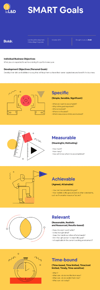
3. Education one-pager example
Some one-pagers exist purely for educational purposes. In this case, combining instructional design techniques with clear language and graphics can help you get your message across in a memorable way. The more substance that’s contained in an educational one-pager, the more shareable and effective it will be. Consider this one-pager example.
4. Course one-pager example
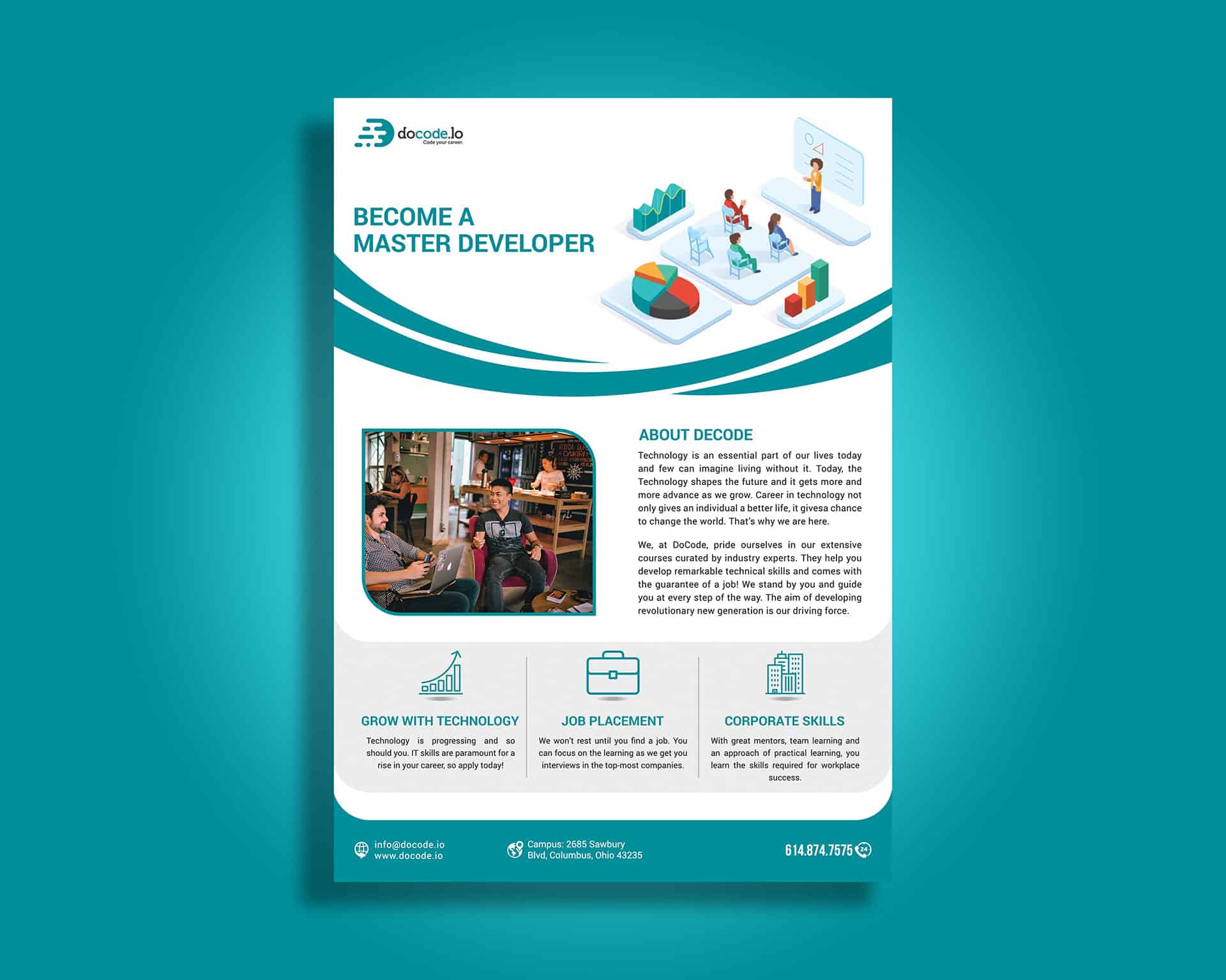
You can promote your course with a one-pager as well. The example below uses a simple format and minimal copy to convey its message. The designer used three sections at the bottom to highlight the core benefits. And when readers want to learn more, all they have to do is read the brief “About” section. Short. Sweet. To the point.
5. Mobile app one-pager example
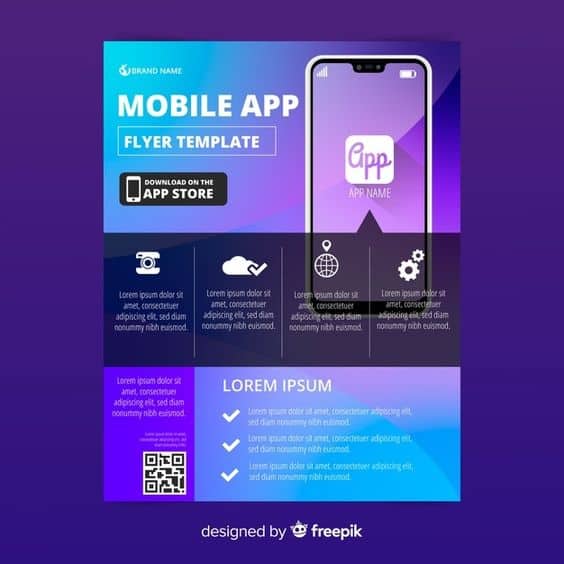
Want to tell the world about your new app? You can create a one-pager for it. This mobile app one-pager example uses minimal copy, offers a QR code to easily download the app, and leverages white space for a show-don’t-tell approach to one-pager design.
6. Investor one-pager example
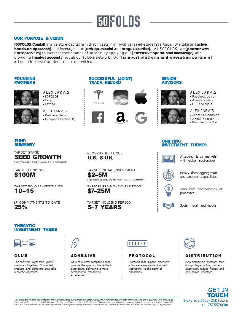
Here is an investor one-pager. This was created as an example and template by Alexander Jarvis. What we like about this example is its simplicity. The creator emphasized the important numbers using large fonts. There’s space for a purpose statement, investor bios, and other key details from investors.
7. Biography/speaker one-pager example
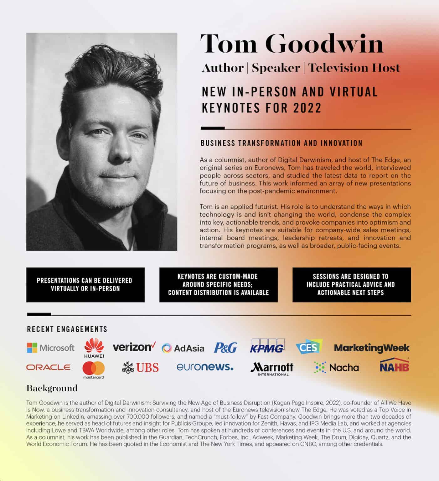
One-pagers aren’t exclusive to businesses. A good one-pager can be used to promote a book, your speaking page, or a specific service or event. Here’s an example from author and columnist, Tom Goodwin. He uses headlines to give readers a quick summary of his experience–and leverages brand logos as social proof. When readers want to learn more, they can read the sharp bio Goodwin included.
8. Recruiting one-pager example
One-pagers are a great way to showcase an open job position. Recruiting one-pagers like the one below can be as simple or in depth as you like. For more technical roles (like specialized developer roles), the more information, the better. For less technical roles, you can use a simple graphic like the one below. Publish it on LinkedIn. Send it directly to prospects. Or share it with your team to find referrals.

Tools for creating a one-pager
One-pagers can be as simple or complex as you like. You can design them using anything from Google Docs to professional graphic design tools. Create them from scratch or make them using a template. There are many options when it comes to one-pager design tools, so here are just a handful of our favorites:
- Canva: This is the top freemium online graphic design tool. Canva provides many great templates, making it fast and easy to draft simple one-pagers without downloading software.
- Stencil: This is another popular online graphic design tool. Stencil lets you quickly design graphics and edit photos. It uses a drag-and-drop design format that’s easy to learn—and great for creating one-pagers.
- Adobe Illustrator and Photoshop: Likely the most famous graphic design and photo editing programs ever built, Illustrator and Photoshop by Adobe will give you all the features you need to create sleek one-pagers.
Creating an eye-catching one-pager starts with selecting your favorite graphic design tool. If you’re looking for more tool options, here’s our list of 16 top graphic design tools.
Make marketing simple with a one-pager
One of the most common mistakes in marketing is that people overcomplicate it. The same applies when it comes to creating a one-pager. Sure, it helps to have examples for inspiration and to know how others have created them for their businesses.
But at the end of the day, the goal of your one-pager is simply to distill the core elements of your message down into a short, digestible message that readers can skim and quickly comprehend.
That means most of the work goes into distilling your message down to its shortest and clearest points. It may take a few tries. Clarity is often the result of revision. But once you have your one-pager in place, it can be a go-to marketing and sales resource for years to come.
