10 Steps for Creating a Product Landing Page That Converts
Building a product landing page can feel like a nightmare for most entrepreneurs. You need to come up with a design that grabs your visitors’ attention, shows off your product, and convinces them to part with their credit card details. Sound like a tall order?
It needn’t be. As with most marketing, simple is often best.
Whether you’re selling a digital planner or body lotion, there are some tried and tested principles to help you build a product landing page that stands out.
10 steps for creating a product landing page that converts
Here are our 10 essential steps for building a landing page that converts customers.
1. Know the aim of your landing page
First, you need to define what you want to achieve with your landing page. While increasing conversions is top of your priority list, that goal in itself is pretty broad. The key is to ask yourself what a conversion is and what it means to your business.
If you’re creating product landing pages your goal will probably be boosting sales and generating more profits. But it could also be converting returning customers to upgrade their recently purchased product or to subscribe to a higher membership tier.
Knowing the goal of your landing page will help you write compelling headers, CTAs and maintain a clear approach.
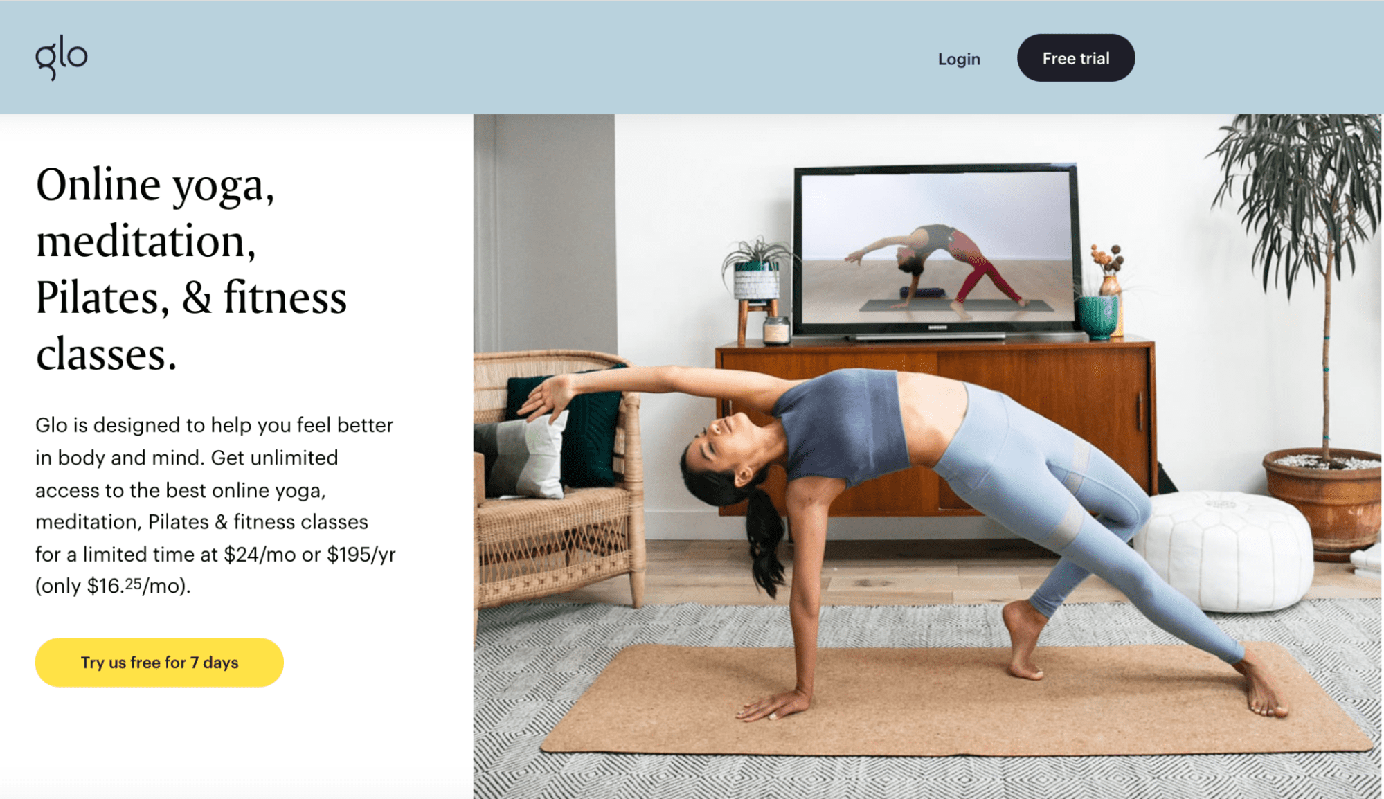
In this example from fitness class provider Glo, the copy has been written with a clear aim in mind––to tell customers what a subscription purchase can give them.
2. Write an attention-grabbing heading
The heading is the first piece of copy your audience will read when they visit your landing page. To keep people on your page you need to entice them with a compelling headline that makes them want to learn more about your product.
The key is to keep it short and sweet. Strike the balance between describing your product in enough detail to explain what you’re selling without making your heading too long.
When you have a small space to convey your message, every word you choose counts. Eliminate any fluff or filler words and aim to write snappy copy that encourages readers to click through your CTA button.
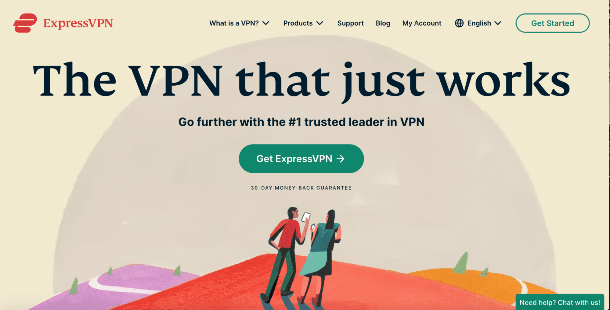
ExpressVPN does a great job of explaining their USP (a VPN that just works) and providing some credibility (#1 trusted leader) in their heading. In a few short words, customers have a clear idea of what to expect from the product and why they should choose ExpressVPN over competitors.
3. Stick to your brand voice
Maintain the same brand voice you use throughout your website and social media channels in your landing page copy too.
You can also add some personality to your landing pages and convey the tone of the brand you’re writing for. But take care not to go overboard and sound obnoxious.
For instance, you could use humor and rhetorical questions to joke around with readers. Having a funny page is a great way to build rapport and develop a connection with customers.
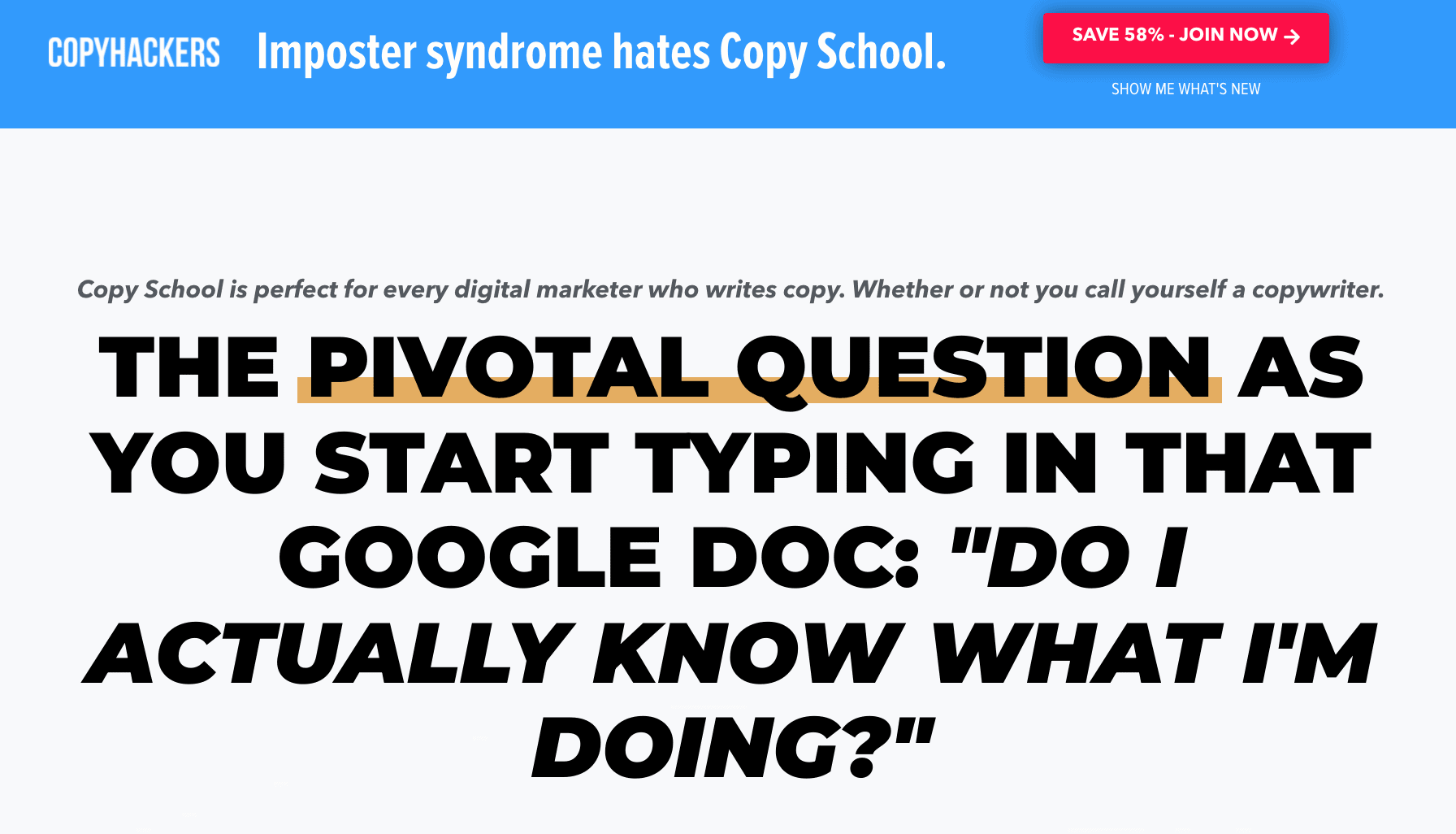
CopyHackers does a great job of showing how to inject humor into copy while still effectively selling their product. Their rhetorical question does a great job of tapping into copywriters everyday thoughts and concerns while being funny.
4. Keep the copy and design simple
People are attracted to great design and aesthetics. Creating an eye-catching landing page will help you keep more visitors on the page and encourage them to click through to your offer.
Keep it minimalistic and easily skimmable—landing pages are meant to be quick stops on your site that help achieve a specific goal. Avoid too many images, lines of text or changing color palettes.
Instead, make sure the page is easy on the eye by sticking to one color scheme, an easy-to-read font, and limited text. Design the layout so that it draws the reader’s eye into the page and across it.
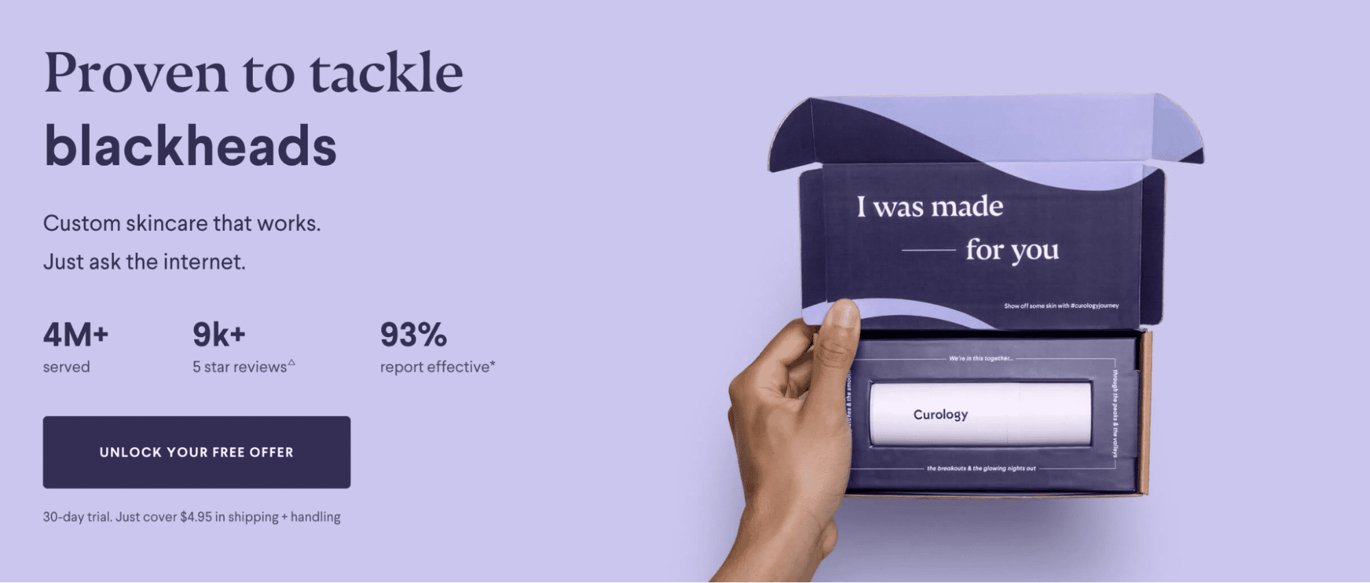
Skincare brand Curology’s landing page is a great example of a well-balanced landing page that sticks to a consistent color scheme. It also has just the right amount of text balanced with whitespace and a product image.
5. Include a single clear CTA
Remember the aim of your landing page? Use your aim to write an ultra-clear CTA that directs customers to take the next relevant steps.
Make your CTA clear, concise, and easy to see. This is your chance to tell site visitors exactly what it is you want them to do.
Only include one CTA on your landing page to keep the page focused on your aim. Make it easy for customers to get to the next page by including a live working link and not redirecting them to multiple places.
Keeping your CTAs simple and focused on your conversion aim will help more people find your CTA and click through it without any confusion.
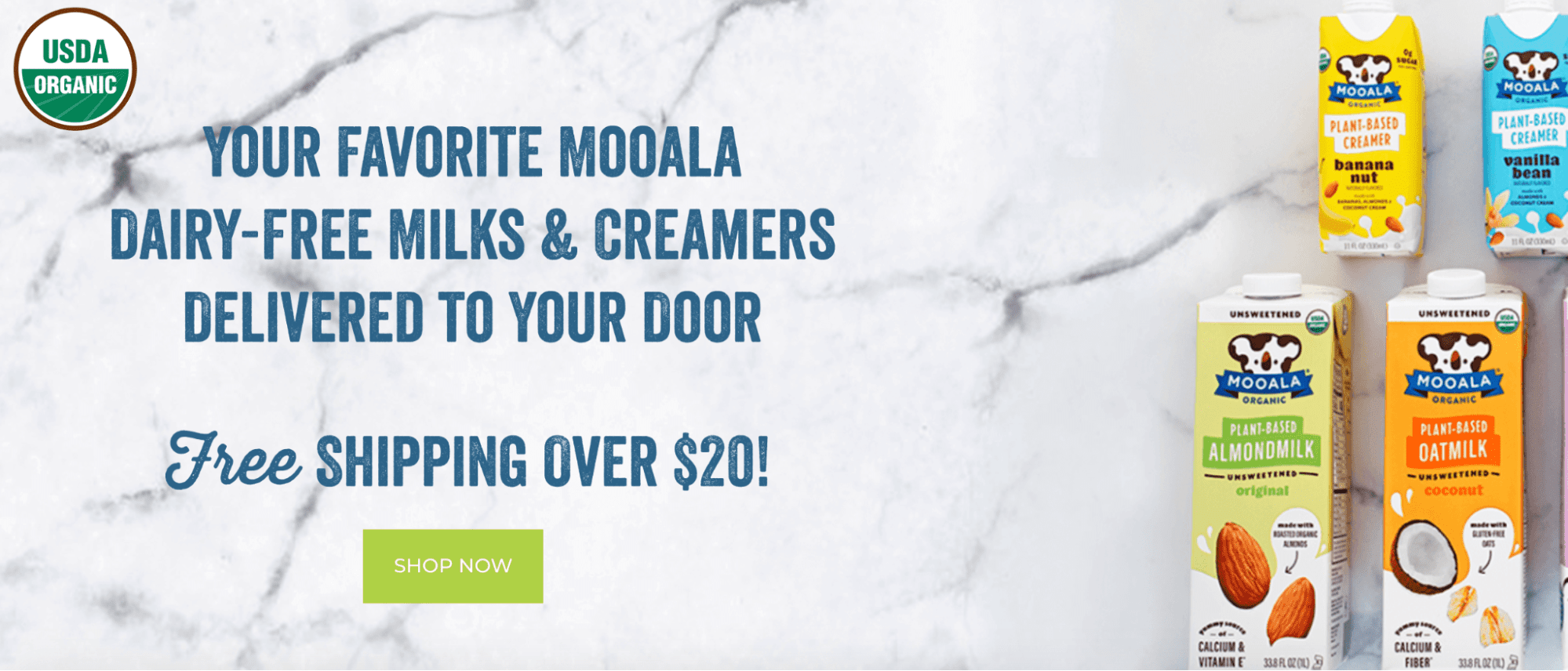
Dairy-free milk brand Mooala has a clear and actionable CTA button that tells readers to “shop now.” The button is also placed directly below an advert for “free shipping over $20” further encouraging customers to click through.
6. Consider including customer testimonials
Including social proof on your landing page is a powerful way of encouraging more customers to convert. Adding product reviews shows potential customers that your product has satisfied previous buyers.
Products without visible reviews can seem like a risky purchase to new customers. But when potential customers see that other people are happy with their purchase of your products they’ll be more likely to convert.
Try collecting reviews through social media and other third-party review sites. You could then select the best most detailed product reviews and display them on your landing pages.
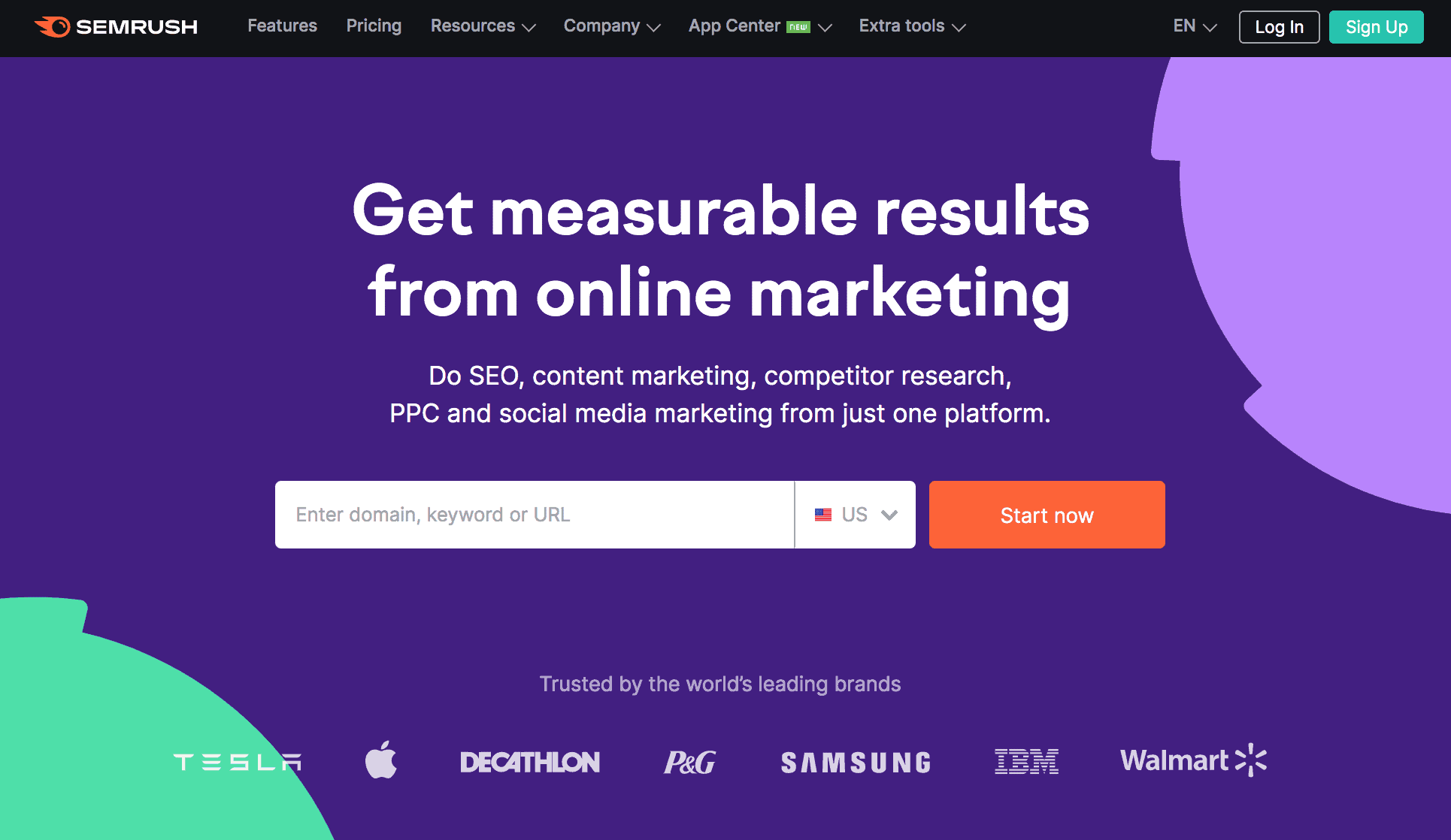
SEO tool suite SEMrush shows a list of Fortune 500 brands who trust their software and below they include a few customer testimonials to encourage those who might be sitting on the fence about the purchase.

7. Keep your form short
If your product is customizable or requires a customer subscription you might need potential customers to fill in a form before they make their purchase.
Keep your form short, sweet, and simple to prevent customers giving up before they’ve finished your form. Don’t bombard customers with too many questions or form fields to fill in, instead focus on asking just the necessary details for them to receive a product they’re happy with.
Choose a form setup that allows users to jump through the questions by pressing enter instead of having to fill out everything at once. These forms are less overwhelming as users don’t see 10 questions all at once and instead make their way through them step by step.
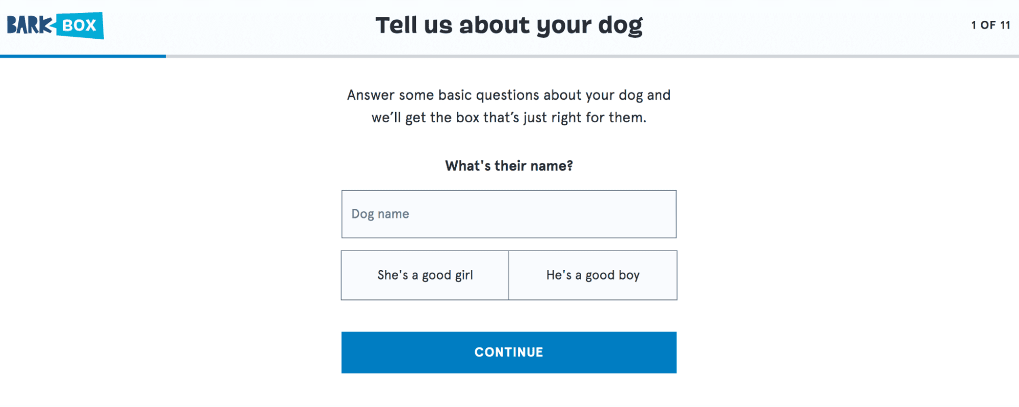
Dog toy and treat subscription box, BarkBox makes it easy for customers to answer a few questions about their four-legged friend before offering the product that’s right for them based on their answers.
8. Make it mobile-friendly
In 2021, mobile retail commerce made up 72.9% of all retail e-commerce sales worldwide. This figure is only set to rise so it makes sense to prioritize making your product landing pages mobile-friendly too.
Choose a landing page design that’s easy to replicate on mobile devices. For example, opt for vertically-oriented images that fill the length of smartphone screens instead of landscape ones that leave too much space.
Make sure your CTA is easy to click on from a mobile device too and that your copy is large enough to read. These tweaks and attention to detail will help ensure you maximize your opportunity to boost conversions on mobile too.
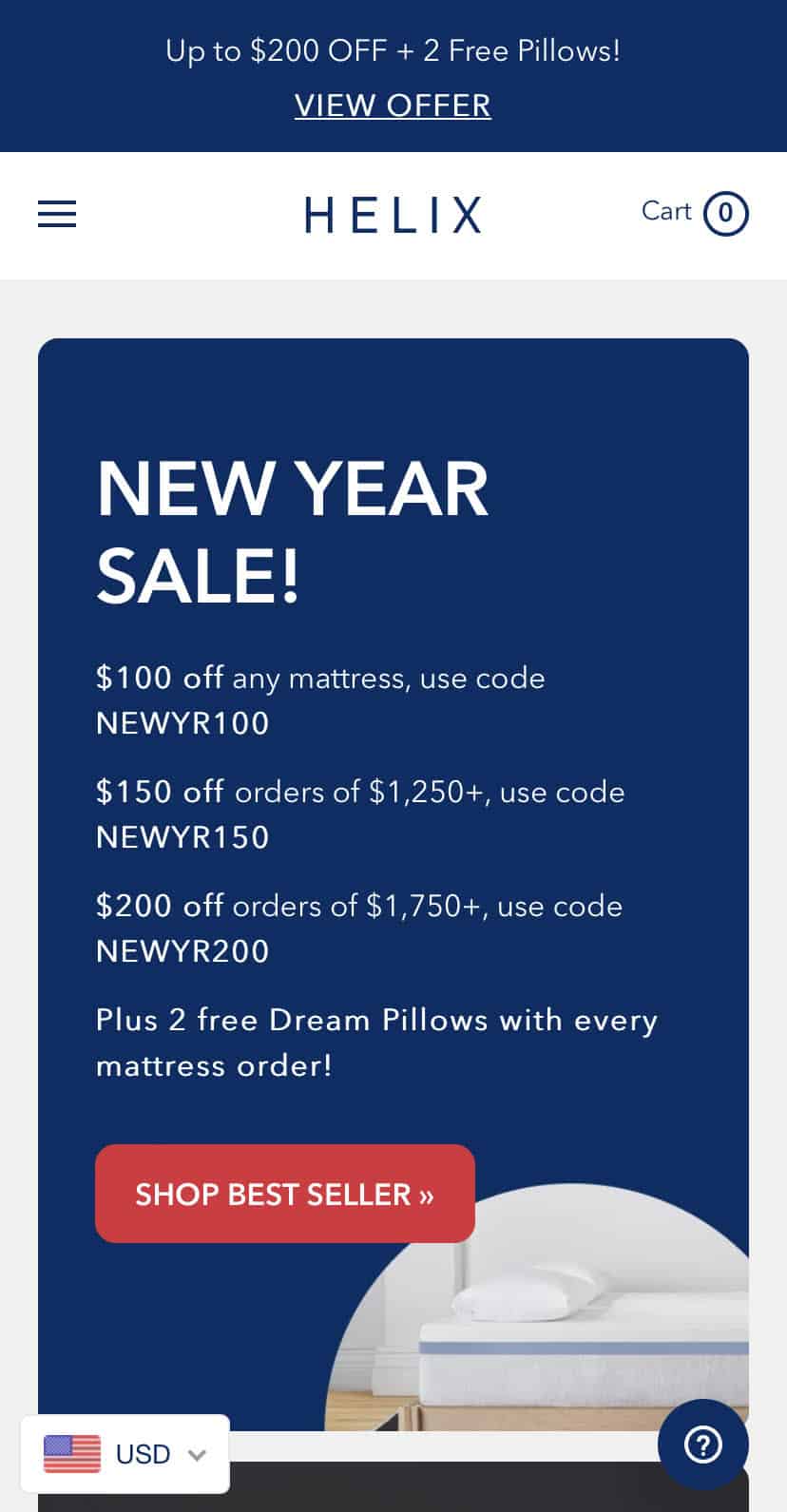
Mattress brand Helix has a clear product landing page that includes their top offers and a single CTA directing visitors to shop their bestsellers.
9. A/B test to identify what works
A/B testing is an effective technique for finding out what works to boost your conversions and what doesn’t.
To effectively test and optimize your landing pages, it’s best to use A/B testing tools to help you drill down on the data.
Tools like Unbounce enable you to A/B test your landing pages to find out what works. Use Google Analytics to identify how people arrive at your landing pages. See which parts of your landing pages are most attention-grabbing with a heat map tool like Crazy Egg.
10. Always make adjustments
There’s always room for improvement. And there’s no secret one ingredient for improving conversions. You can read tons of guides and watch tutorials but nothing will work for you like your own system based on your own trial and error.
To keep increasing your conversion rate, you need to regularly adjust, tweak, and modify your product landing pages. Don’t be afraid to try something new and keep a record of what works for your brand.
Start building product landing pages that convert
Building a product landing page that converts is both an art and a science. You’ll need the right combination of original creativity and proven tactics to make it work for your business.
Whether you’re building your first product landing page or you’ve built hundreds, it never hurts to keep tweaking and testing your page. And always remember it will take some experimentation until you find the winning formula that boosts your conversions.
While you’re building your next product landing page, why not check out the AppSumo Store? We have some of the best software deals available today.
 By
By