What is a Splash Page and How to Create One
Customer expectations are growing more demanding every day. So, it’s essential to optimize every touchpoint, from your landing page to your contact page to your blog posts.
And that’s where splash pages come in!
Here is a guide that will help you better understand splash pages, their benefits, and, most importantly, how to create one.
What is a splash page?
A splash page is a company’s introductory page to its actual website page. It is a simple page or a pop-up with a single message, used for promotional purposes or to fulfill business needs.
A splash page differs from a landing page or a homepage in that it (usually) only contains a tiny piece of content. It only serves as an entry point to the website, and it is designed to come before the homepage, landing page, or content page of a website.
Why is having a splash page a good idea?
First of all, having a splash page on your website may seem like a bad idea, as it prevents visitors from going directly to the page they clicked to open. And in that sense, it could be annoying.
That’s a valid point.
But the reality is that visitors will only need one more click to get to the page they want, and the benefits of a splash page ultimately outweigh any disadvantages you may imagine.
Showcase
In most cases, a splash page is used to showcase a company-related animation, product, logo, or even a simple click to enter the site.
You can also use it for special occasions like New Year’s Eve wishes, Black Friday offers, or to advertise for other sites, as is the case for news sites. You can also display an announcement to release a service/product or simply talk about yourself and your business.
Here is an example from Yulu Moreau.

This is a great example of a splash page showcasing what the website is about, where he lives, and the message he wants to get across.
Grab visitors’ attention
Splash pages are generally positioned to appear before the user can enter the site and view other pages. Think of it as The Time Square on your site displaying a unique offer or call to action you want visitors to act on before accessing your site.
This is what makes it ideal for drawing visitors’ attention to warnings, disclaimers, time-sensitive announcements, etc. Here is an excellent example from Canva.
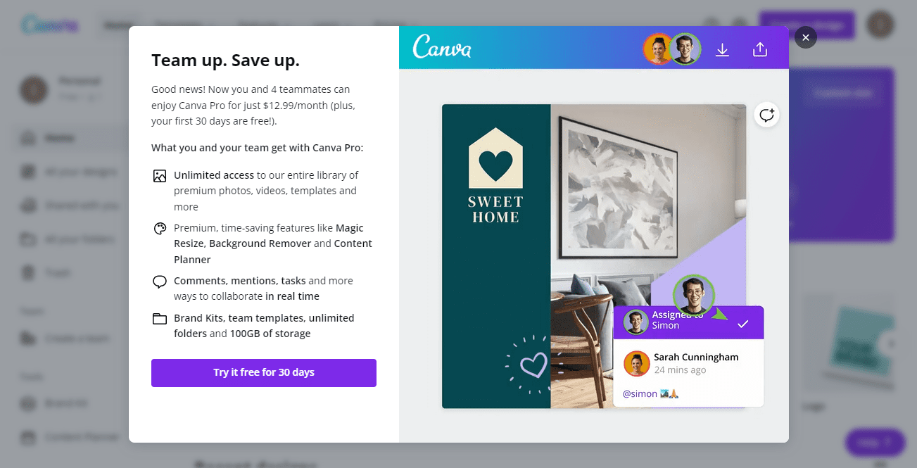
This splash page from Canva is the perfect example of how you get visitors’ attention using a colorful and scannable splash page.
Provide visitors with content they deserve
For some sites, having a splash page can be mandatory as it may be a required screening to give visitors the experience they deserve. This could include language, age, gender, content type, a display mode, etc. Here is an example from Patron Tequilla.
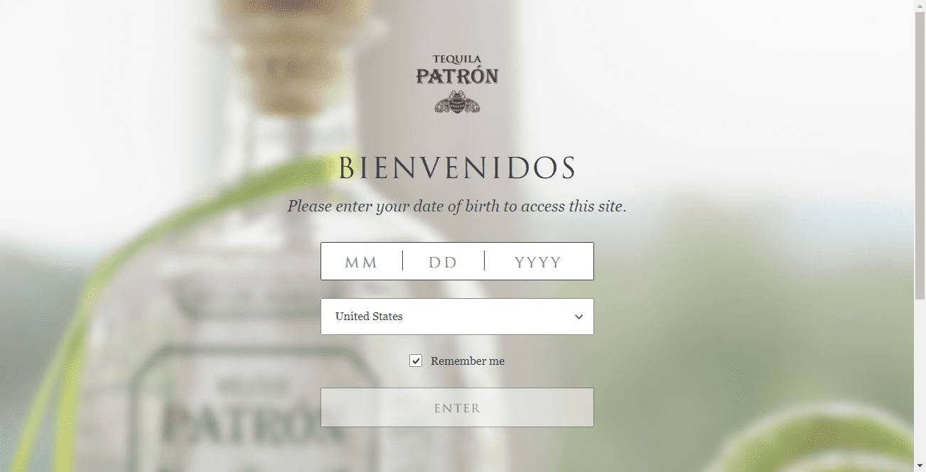
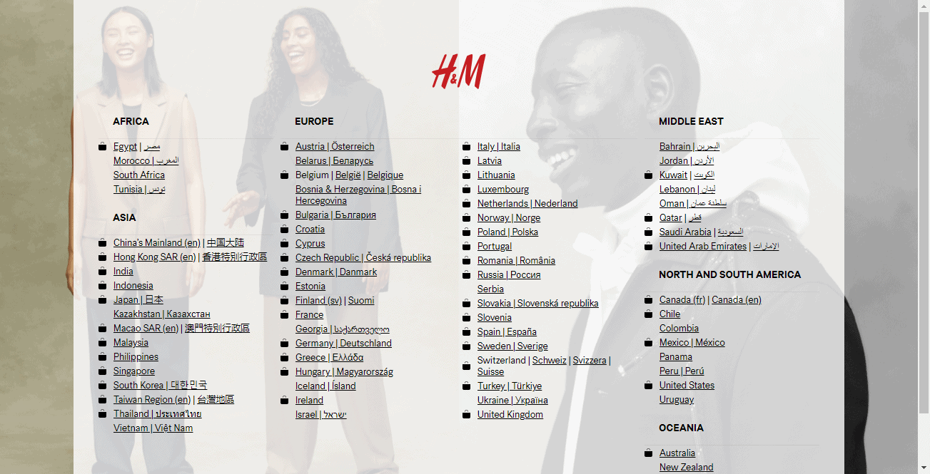
Additionally, a splash page is also an excellent tool to make your visitors choose their preferred navigation options. Doing so will help you match your site’s content to your visitors’ preferences and ensure they enjoy a pleasant experience right from the start.
Here is an excellent example of this from H&M.
3 elements of a great splash page
A splash is not a landing page. So, it does not require as many components to be perfect. You only need to weave together three key elements to come up with a great splash page.
1. A high-quality image or animation
Create eye-catching visuals for your splash page. One of the main features of a splash page is that it should be easy to skip. And the first step to prevent visitors from immediately skipping the page as it loads is to use a captivating image.
You can include a photograph of a product, a background image, a video, or an animation. Just make sure that whatever you include doesn’t hurt your page’s loading time.
2. A clear and succinct message
The second element is the copy. Often, the fewer words you use, the better. Visitors should not have to read paragraphs before reaching your site.
Keep the text short, with as few words as possible. It can be one sentence or two, but either way, make sure the message is clear and action-driven.
3. A clear exit option (plus a call to action)
Remember that the splash page is not the visitor’s priority. So, you need to add a clear exit button that takes them to the page they wanted to land on in the first place. The button copy can be anything like:
- Continue to page
- Scroll to site
- Take me to the page
- Close/Skip
While you’re at it, add a call to action to your splash page. Again, keep in mind that visitors’ priority is to get to the content they came in for. So, your CTA should aim at getting them to perform a quick action and getting back to what they came for. This will depend on your needs and goals.
With that in mind, here are some potential goals your CTA can circle:
- An announcement (for a new product or a limited offer)
- A verification requirement (age, gender, location, etc.)
- A quick tip for a better experience (saving the page, running on a specific browser, looking in the camera, etc.)
- An opt-in form to collect user data (email, name, etc.)
- A warning (sensitive consent, etc.)
- A quick ad
4 splash page best practices
Designing and adding a homepage to your website is one thing. Creating a page that hits the mark and brings you great results is another.
We’ve put together five best practices to help you design unique splash pages that drive results.
Make it light
The time your splash page takes to load can be the difference between a great splash and a hurtful one. Websites usually take anywhere between two to five seconds to load. This means that your splash page has to beat this load time to be effective.
A splash page with a poor loading speed will make even the most patient people leave a page. Get insights into how the elements in your splash page affect its overall load time (especially the visual elements) to keep it light by eliminating unnecessary components.
Use light overlays and pop-ups
You can display your splash page as a lightbox overlay or pop-up window above the visitor’s desired page. This strategy allows visitors to know that they are on the right page even when their screen is occupied by your splash page.
On the other hand, you can make the pop-up window appear 3 seconds after the visitor lands on your website. This way, they know they are in the right place and just need to shut the pop-up to access the desired content.
Make it aesthetically appealing
One undeniable truth about splash pages is that they’re impossible to miss. In most cases, visitors aren’t expecting a splash page, so sending the wrong impression at first glance can be a costly mistake.
Make sure you adhere to image design and layout principles to ensure a good visual hierarchy. Consider the size and placement of each element. Make sure the design is cohesive and presented in a well-organized and efficient manner.
Keep it consistent with your brand
Like many companies, you probably have a unique logo, color, messaging, tone, and voice. Ensure your splash page is well-aligned with your brand to reinforce your branding efforts and make you memorable to visitors.
Bonus tip: Keep an eye on analytics
Analytics lets you know how visitors are engaging with your splash page and thus how it is performing. This will provide you insights into what you need to improve for a better engagement or whether you should take the splash page down altogether.
Here are some analytic metrics to focus on:
- Bounce rate
- Time spent on page
- Click-through rate
- Form submissions
Keep in mind that the metrics you track depend on your goal with the splash page. For example, if your call to action intends to verify visitors’ age, language or get them to sign up for their email addresses, you should track form submissions.
On the flip side, if your CTA links to your portfolio or an ad link, track the click-through rate.
4 amazing splash pages examples
Here are four outstanding splash page examples to help you see it in action and inspire your own.
1. Forbes
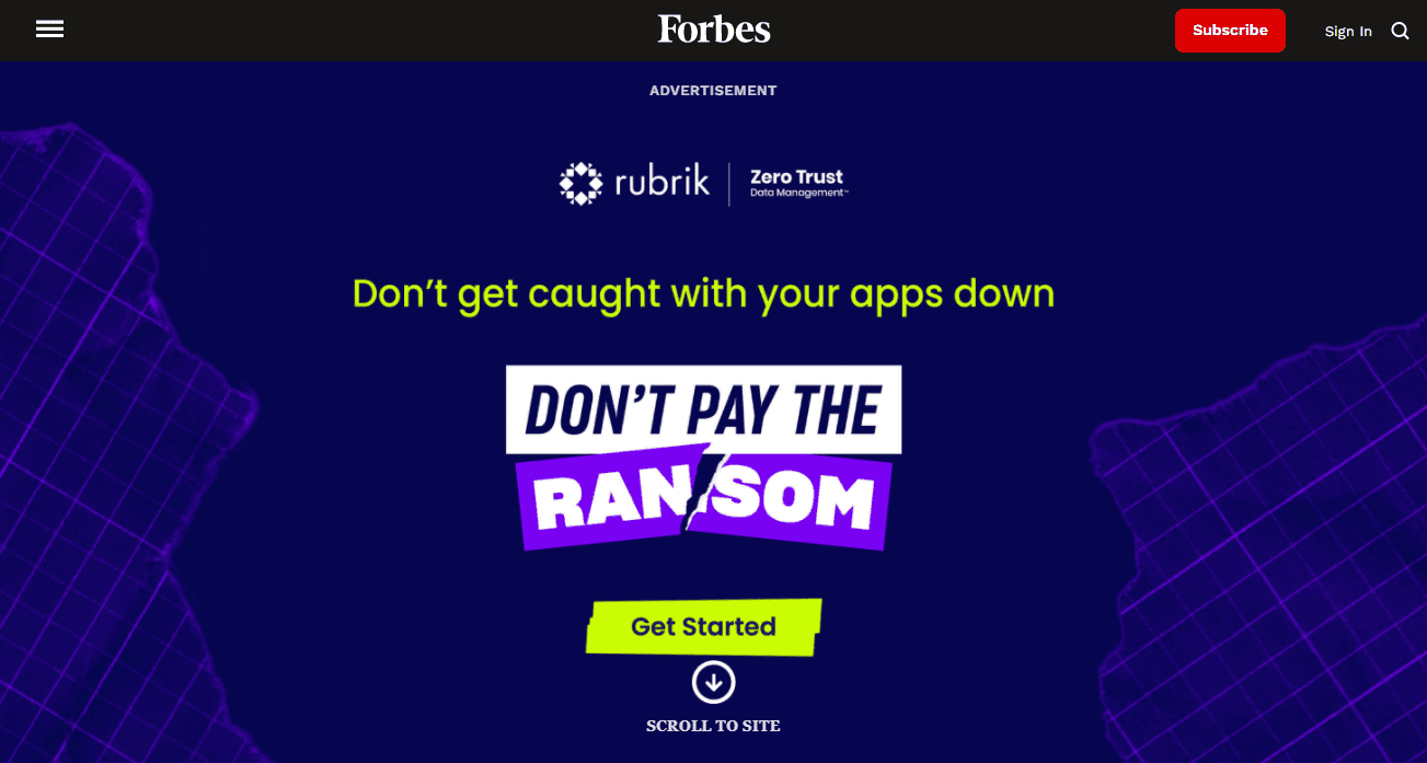
Purpose: Advertisement
What we love about this: Forbes uses its colossal traffic potential to display splash page ads for other businesses. What’s interesting is that the ad is displayed as a welcome mat. The ad copy is direct and straightforward.
Forbes has beautifully expressed in a few words what it is about and added a clear CTA for users to get started. The page also features a “scroll to site” button that makes the ad disappear as if the actual site was underneath it.
2. Tito’s
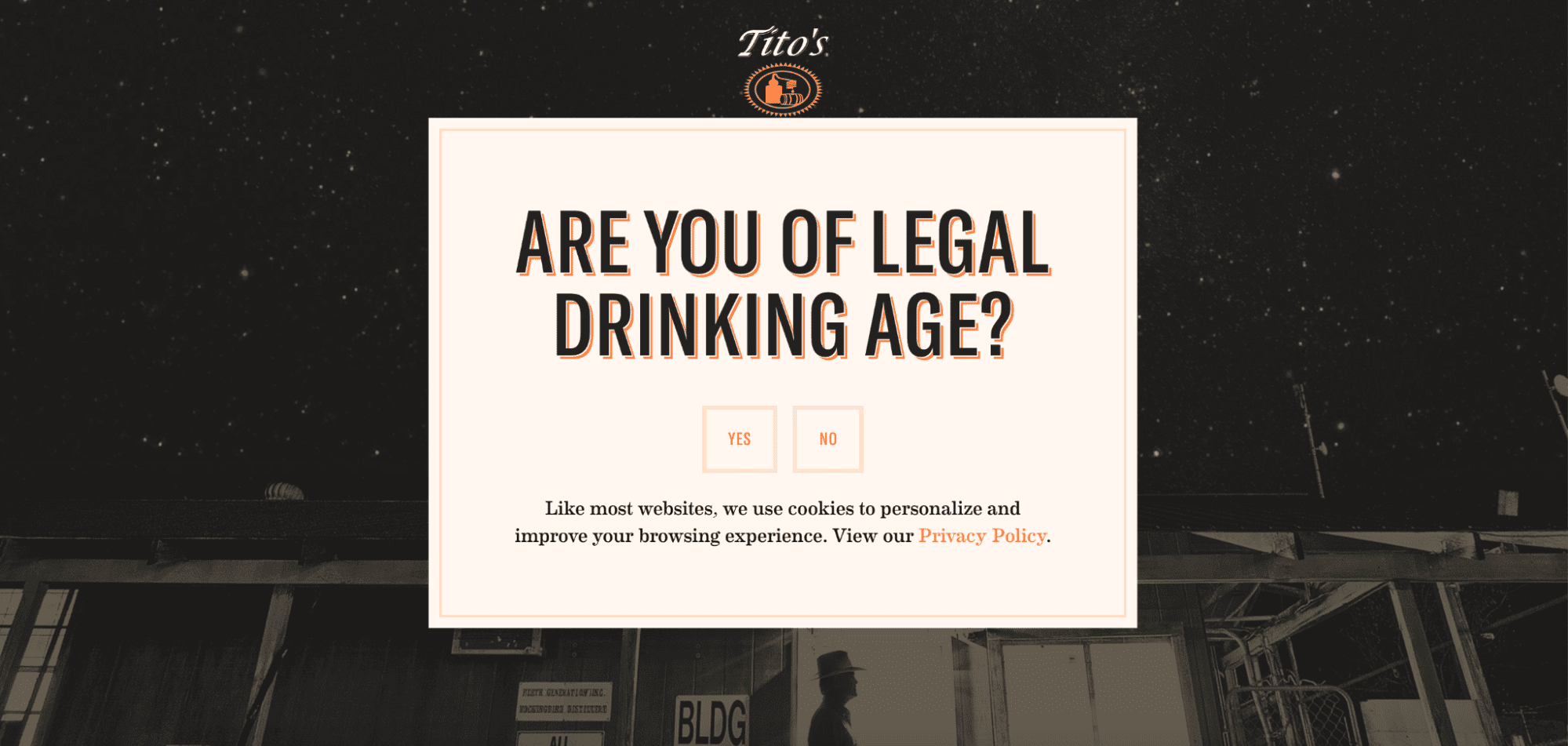
Purpose: Verification wall
What we love about this: This page has a simple yet excellent design that matches what Tito does(their brand colors and their vodka logo). However, there is no exit button as visitors must verify the minimum age requirement before entering the site.
3. Zara

Purpose: Location and language verification
What we love about this: Zara serves in many countries and leverages its splash page to give visitors the best experience possible. One look at the design indicates the company’s color preferences. The splash page is simply designed and contains an easy-to-perform call to action.
4. Conversion Gods
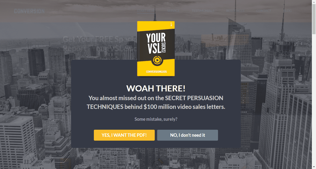
Purpose: Getting visitors to download a resource in exchange for their email addresses.
What we love about this: This is a marketing company that has managed to leverage human psychology to speak to its audience. You can see how engaging and conversational the copy is. Plus, it leverages FOMO (Fear Of Missing Out) to get visitors to act quickly.
6 tools to build your splash page
Now that you have an idea of what goes into creating a good splash page, here are some tools to help you create one.
1. Strikingly
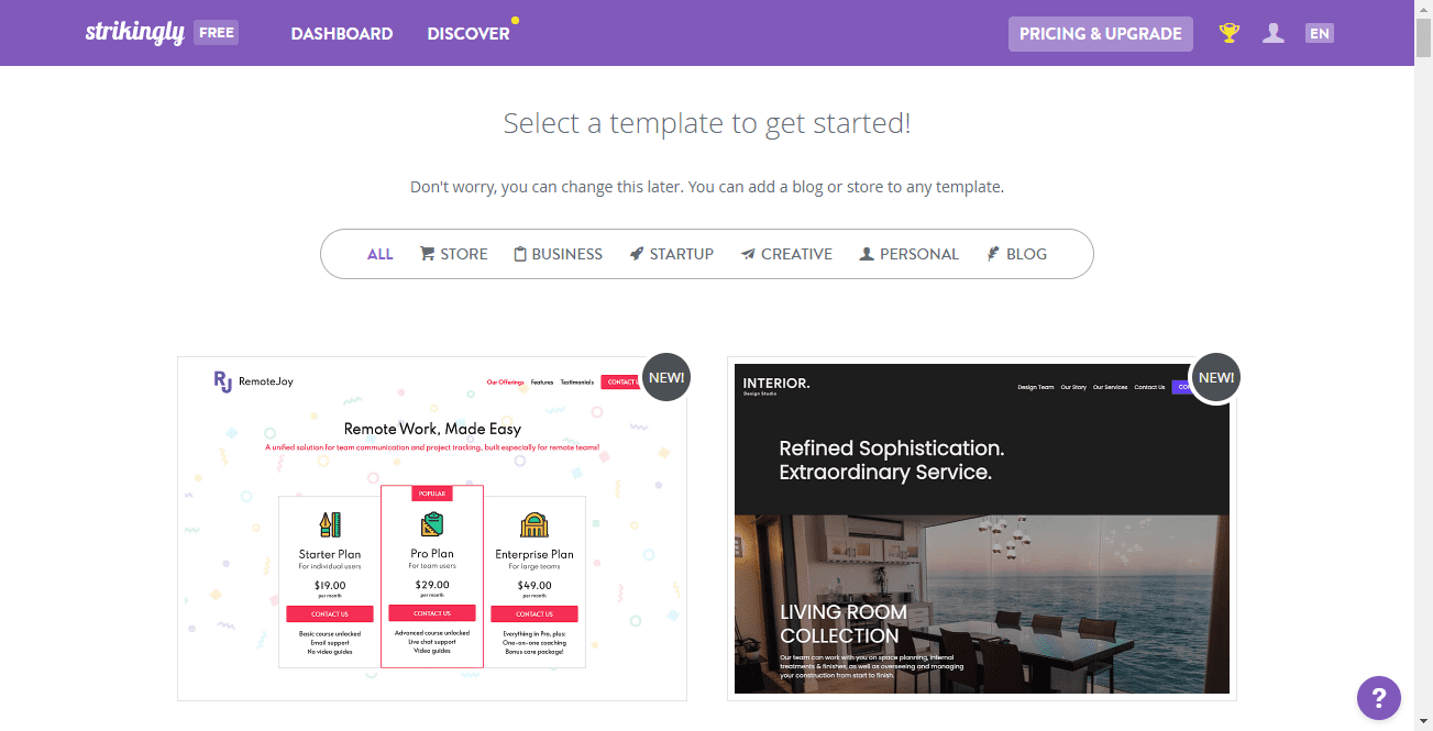
Strikingly is the go-to tool for creating splash pages. It is designed to help anyone build user-friendly and responsive websites efficiently.
Strikingly hosts a library of features and page-building templates you can edit without any coding or programming skills—making it the most straightforward tool for creating splash pages.
2. Instapage
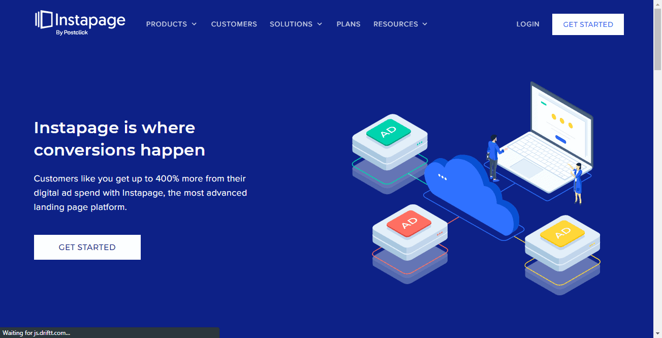
Instapage is a website builder that helps you quickly design your splash page using professional templates. Instapage works the same way as Strikingly. It offers a fully customizable landing page builder, a plethora of features, templates, and a clean and intuitive user interface.
With this tool, you can bring any splash page design to life with the least amount of effort.
3. Unbounce
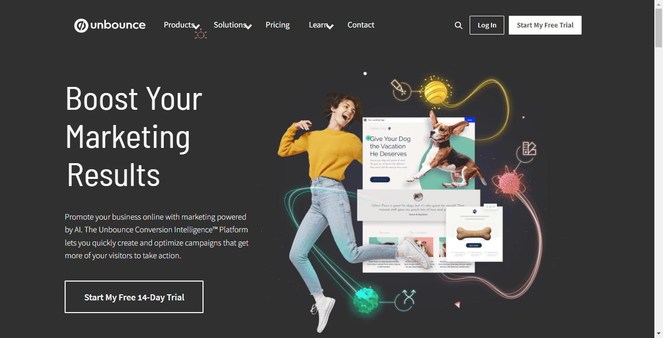
Unbounce also offers a drag-and-drop builder with professional templates that you can leverage to create unique splash pages. They offer templates based on your industry, which you can choose based on your needs or goals. Plus, the tool is AI-powered, which makes it a good choice even for non-technical users.
4. Swipe Pages
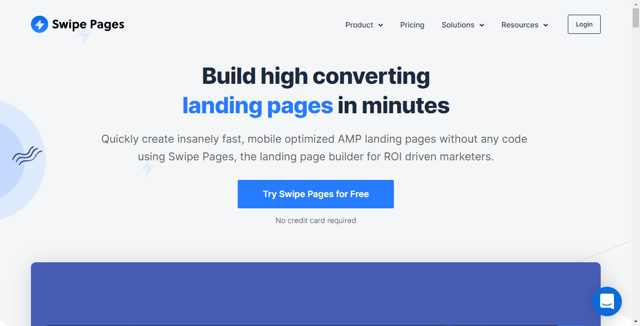
Swipe Pages is a lesser-known tool than the above tools. Still, it is one of the best tools you can use to create your splash page.
Swipe Pages provides templates to start with or lets you create your splash page from scratch. It also offers several features such as drag and drop editing and device visibility option to show or hide elements depending on the visitor’s device. You can also leverage their galleries and carousels to create your splash page in style and entice your visitors.
5. PageMaker.io
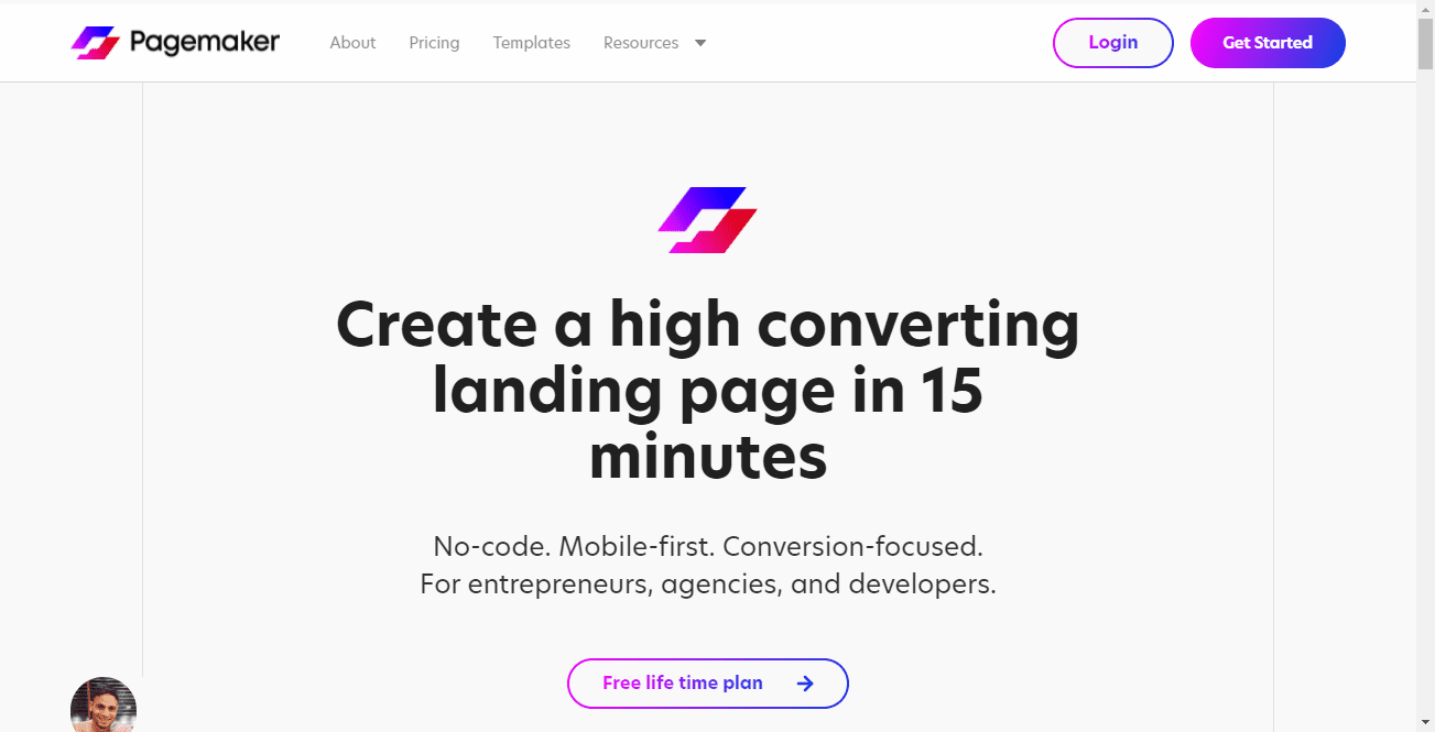
PageMaker.io is a website builder with unique features ideal for mobile-friendly designs. It gives you all the features that competing tools offer, and goes the extra mile by providing templates based on your niche. You can also learn for free on their learning portal.
6. Sumo
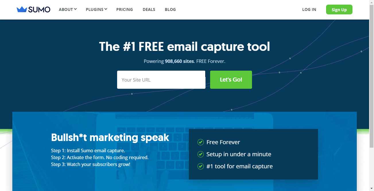
Although it was not originally designed to create splash pages, Sumo is also an excellent tool for creating simple splash pages. Sumo helps you design pages in the form of a welcome mat. You can design a one-pager and add a lead capture form to collect visitor information. You can also add some promotional or marketing information to share with the visitor. Sumo is free forever.
Make a splash with your splash page
There is more to splash pages than most marketers realize. You can use them to get more leads, get your message across or get more eyeballs on a product.
You will need to check a few things to ensure your splash page is effective and does not hinder your site’s overall performance. These include:
- Its goal. Splash pages are more effective when they have a clear and well-thought-out goal. Set one clear goal and center your message around it.
- Its display frequency. Splash pages can be irritating if they appear every time a visitor comes to your site. Make sure your splash page only appears once over a certain time period. This can be once a week, a month, over a quarter, etc.
- Its alignment with your branding. This prevents confusion and ensures the splash page resonates with your brand. It also helps the visitor know that they’re on the right page.
- Its exit button. The splash page’s content is not the reason you built your website in the first place. Make sure that your splash pages can easily be closed.
Now you know what makes a great splash page, but why stop there? Head over to the AppSumo Marketplace to get the best deals on the best splash page creation tools.
