8 Above-the-Fold Optimization Ideas to Engage Site Visitors
What’s the first thing people look at when they land on your website?
You might think that user attention is attracted by stunning imagery or unique claims. And you’re not wrong. But the success of web design that converts largely depends on the way you position high-value elements on the page.
In other words, the layout of your website can determine the extent to which you can engage site visitors.
Of course, this doesn’t mean you should pick a popular WordPress theme for your site and go with it simply because it’s “tried and tested.” Instead, it means you should learn about people’s behavior on the web and employ a variety of tactics to create an online space that caters to their demands.
What is the above-the-fold section?
The phrase “above-the-fold” is a throwback to the world of newspaper publishing and sales. Editors tended to place important, eye-catching news items above the line where the newspaper was folded since this was the area that convinced the reader to choose that particular paper over a less-impressive competitor.
The term has survived the evolution to digital content consumption and now refers to the area of digital real estate that is visible above your monitor’s scroll line.
According to research by the Nielsen Norman Group, people spend 57% of their page-viewing time above the fold, showing how crucial it is for businesses to get this webpage section right.
But this doesn’t mean that your website’s hero section needs to be a hodge-podge of attention-seeking elements that bombard web visitors with sales-y messages. Rather, the above-the-fold design should focus on engaging web visitors to encourage them to scroll, click through, and convert.
So, if you’re looking to give your website a makeover guaranteed to result in better engagement rates, these are the above-the-fold design tactics to help you do just that.
1. A compelling value proposition
People click on links and visit websites, blog posts, and landing pages because they’re looking to solve a pain point. So, if you want to compel web visitors to stay on your site, interact with your content, and potentially convert into customers, you’ll need to optimize your value proposition.
By enhancing your USP to be fully customer-oriented, you can effectively present the real-world benefits your product offers and draw your target audience’s attention to the advantages of using your solutions/services.
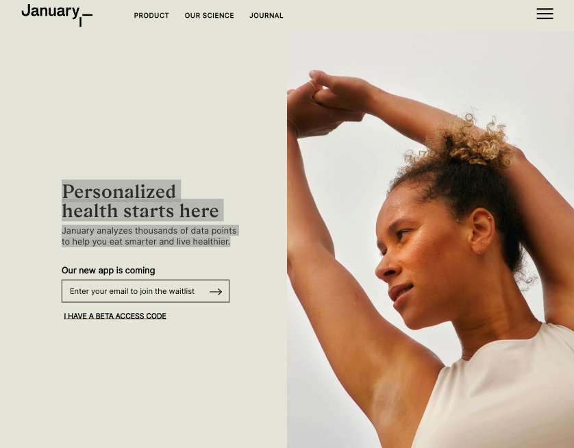
For instance, on the January AI homepage, the value proposition states that “January analyzes thousands of data points to help [customers] eat smarter and live healthier.”
Source: january.ai
This USP works because the brand’s target audience consists of people trying to improve their health through science-backed strategies. So, by highlighting that its app uses data to give users advice, the brand is, essentially, employing a USP that promises web visitors the sought-after benefits that drove them to visit the site in the first place.
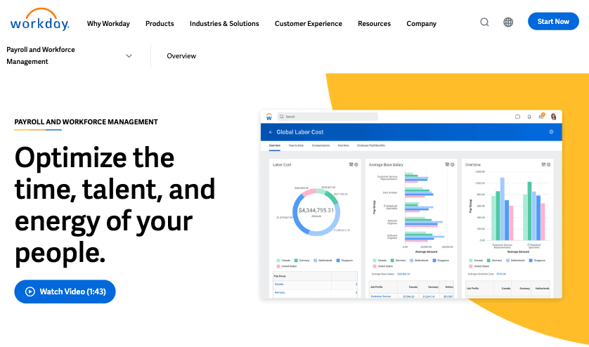
On the Workday landing page below, the brand invites web visitors to “Optimize the time, talent, and energy of [their] people.”
Source: workday.com
With this 9-word USP, the business demonstrates an in-depth understanding of its audience’s pain points. And by turning the value proposition into a CTA, Workday encourages web visitors to further interact with the page (which includes a handy explainer video), which gently moves them down the sales funnel and boosts their chances of becoming customers.
2. Calls to action
Since web users spend the majority of their on-page time interacting with content above the fold, placing high-value CTA buttons in this section can significantly improve on-page conversion rates.
So, whether your goal is to generate leads, inspire people to discover your products or services, or simply educate visitors, explore ways to optimize CTAs on the hero section of your landing pages.
To do this successfully, you need a crucial puzzle piece: understanding your prospects’ position in the sales funnel. Once you know what your web visitors want to accomplish, you can upgrade your CTAs to deliver better results.
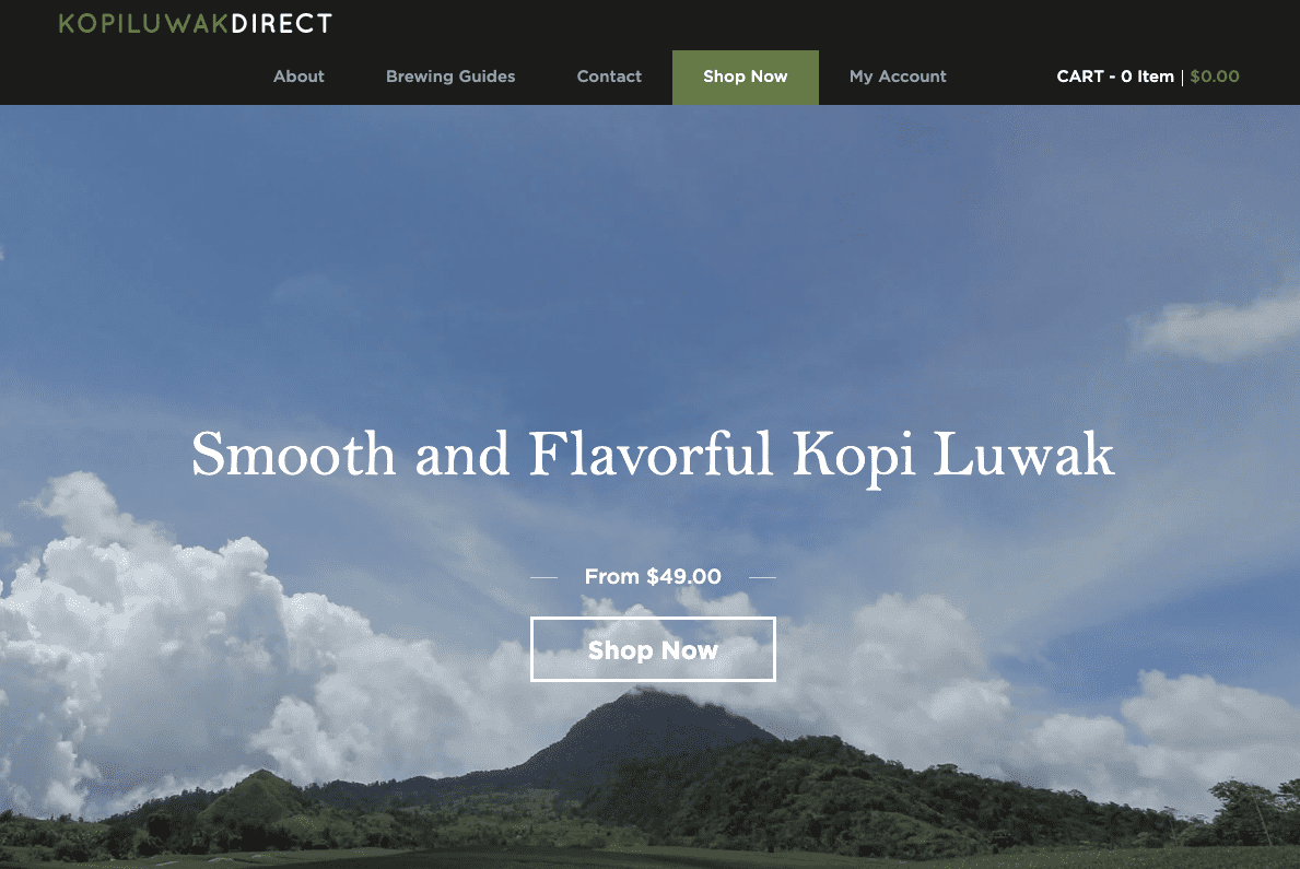
For instance, if you know that the people coming to your website are doing so to acquire a particular product/service, you can take a more minimalistic approach—like the one employed on the Kopi Luwak Direct homepage.
Understanding that its web visitors have one straightforward goal (to buy coffee beans), this brand uses a minimalistic design tactic. It’s perfectly suited to encourage prospects in the bottom stages of the sales funnel to take the desired action.
Source: kopiluwakdirect.com
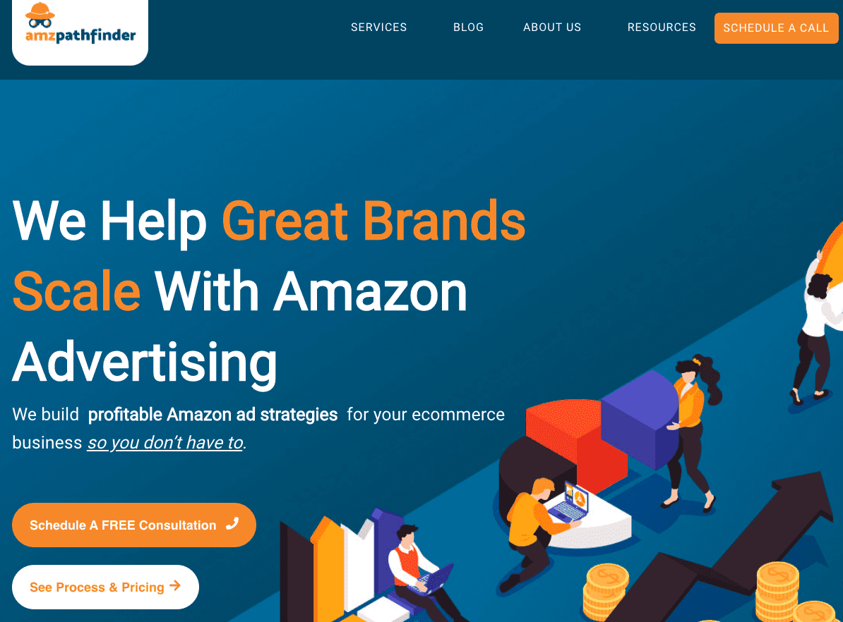
However, if you know that your landing pages are likely to attract a more varied audience, it’s not a bad idea to use multiple CTAs. This is what AMZ Pathfinder does on its homepage. With its most prominent call to action button in the hero section, it invites prospects to “Schedule a free consultation,” with the message being repeated in the top right corner of the page.
Source: amzpathfinder.com
However, the business also understands that some of its web visitors may need slightly more information regarding its services, which is why it encourages potential customers in the upper stages of the sales funnel to “See process and pricing.”
3. Breathing room
Minimal web design is popular for a good reason.
For one, research has proven that a lower level of visual complexity leads to a better first impression amongst web visitors. But leaving a positive first impression is not the only reason to employ minimalistic web design on your SaaS or agency homepage.
Using sufficient negative space on the homepage or landing page:
- has a higher chance of delivering a next-level UX through faster load times
- fosters an easy-to-use, intuitive navigation experience
- tends to come with fewer bugs
- gives you a better chance of successfully making your site responsive
So, if you’re looking to deliver a great UX and allow web visitors to quickly find the elements most likely to inspire them to convert, you might want to reduce clutter on your key pages (or your entire website).
For the above-the-fold section of your site, determine what type of element will grab user attention.
It can be a stunning image, a compelling USP, a CTA button, or a product video. However, using all of these elements in visually dominant ways might overwhelm your visitors. And, in extreme cases, it might even prevent leads from zooming in on that one thing that compels them to convert.
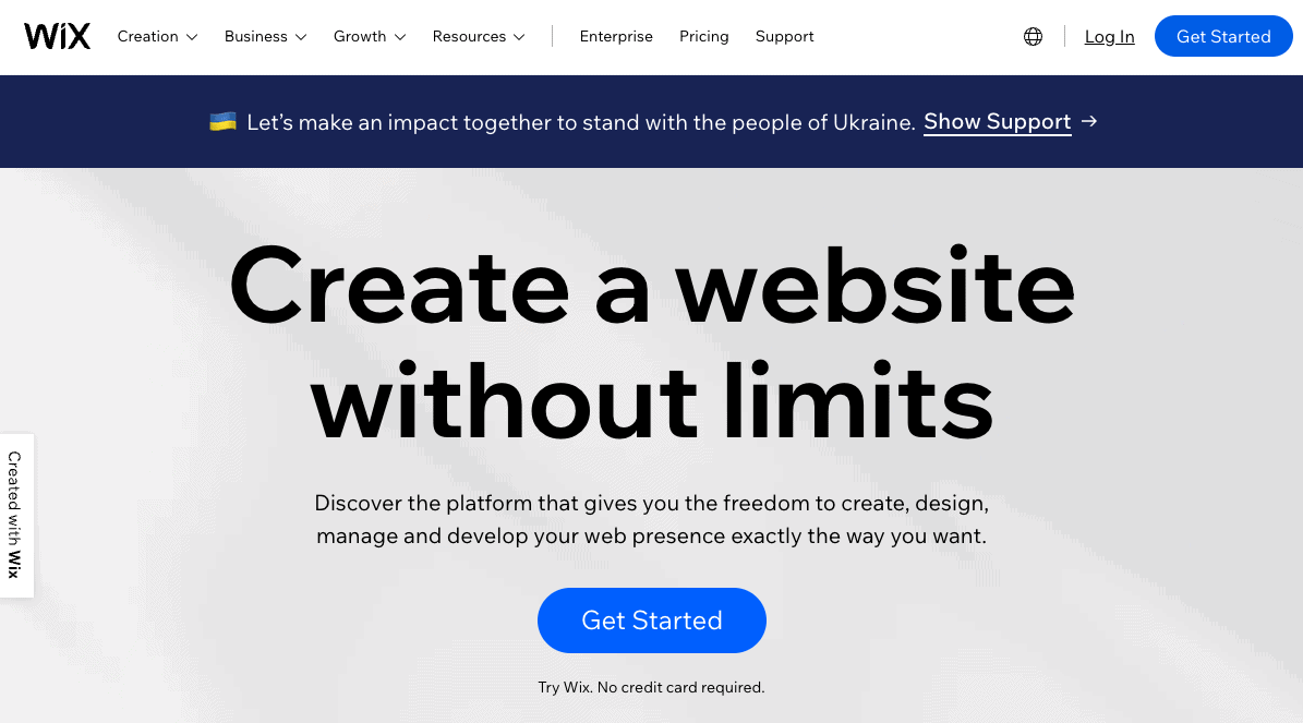
For a great example of a business that understands the impact of simplicity, check out the Wix homepage.
Source: wix.com
By reserving its hero section for a value proposition and CTA (no background imagery), this brand prevents web visitors from becoming distracted by non-value-driving elements and guarantees that they engage with important ones instead (or scroll to gather more information).
4. Meaningful imagery
Employing visuals on your website is always a great idea if you’re trying to engage your audience.
But while using images above the fold allows you to grab attention and communicate conversion-inspiring messages, you still have to ensure that the imagery you use on your website is meaningful and relevant.
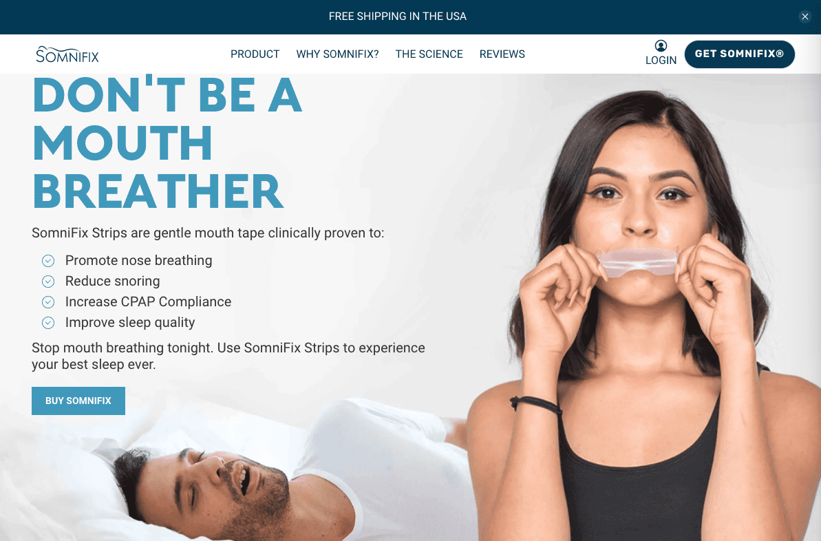
For instance, if you’re selling a practical product, you can choose a more literal approach and show how it will look being used by your potential customers.
SomniFix combines an image of its mouth strip with a compelling value proposition that invites web visitors to stop being “a mouth breather.”
Source: somnifix.com
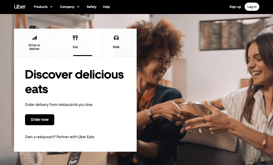
Similarly, for the above-the-fold screenful of its site, Uber chooses a visual that shows the results of customers using its service—two people smiling over a plate of food.
Source: uber.com
Note how the depicted feeling further reinstates the value offered by Uber’s service, heavily relying on emotional marketing, which is often the key to converting end-consumers.
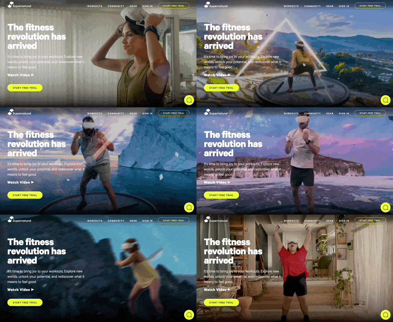
When selling experiences or lifestyle products, you can take a slightly more abstract approach.
Supernatural understands this, which is why it allows itself to go a bit overboard with the main video on its homepage.
Source: getsupernatural.com
The brand knows that its target audience doesn’t want traditional fitness solutions but rather something that’ll inject a dose of excitement into their workouts.
5. Your product’s core functionality
More often than not, the best way to engage site visitors is to employ traditional marketing tactics that call prospects’ attention to the benefits your products or services can deliver. However, sometimes you can achieve far better results by giving web visitors something a bit more concrete to latch onto.
One way you can accomplish the latter is to showcase your product’s core functionality above the fold. After all, why describe something if you can show it? Allowing visitors to try out your product for themselves can be a superb way to experience its benefits and a handy way to aid your lead-generation efforts.
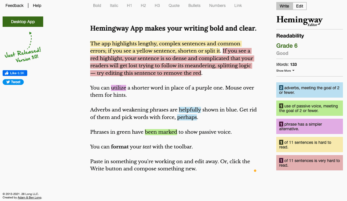
One exceptional example of this engagement-boosting tactic in the first screenful of a website comes from Hemingway Editor.
Instead of making its users click through several pages after landing on its website to use the free software, this brand turns its web app into the homepage, while the conversion elements (like the CTA button in the top left corner) take second place.
Source: hemingwayapp.com
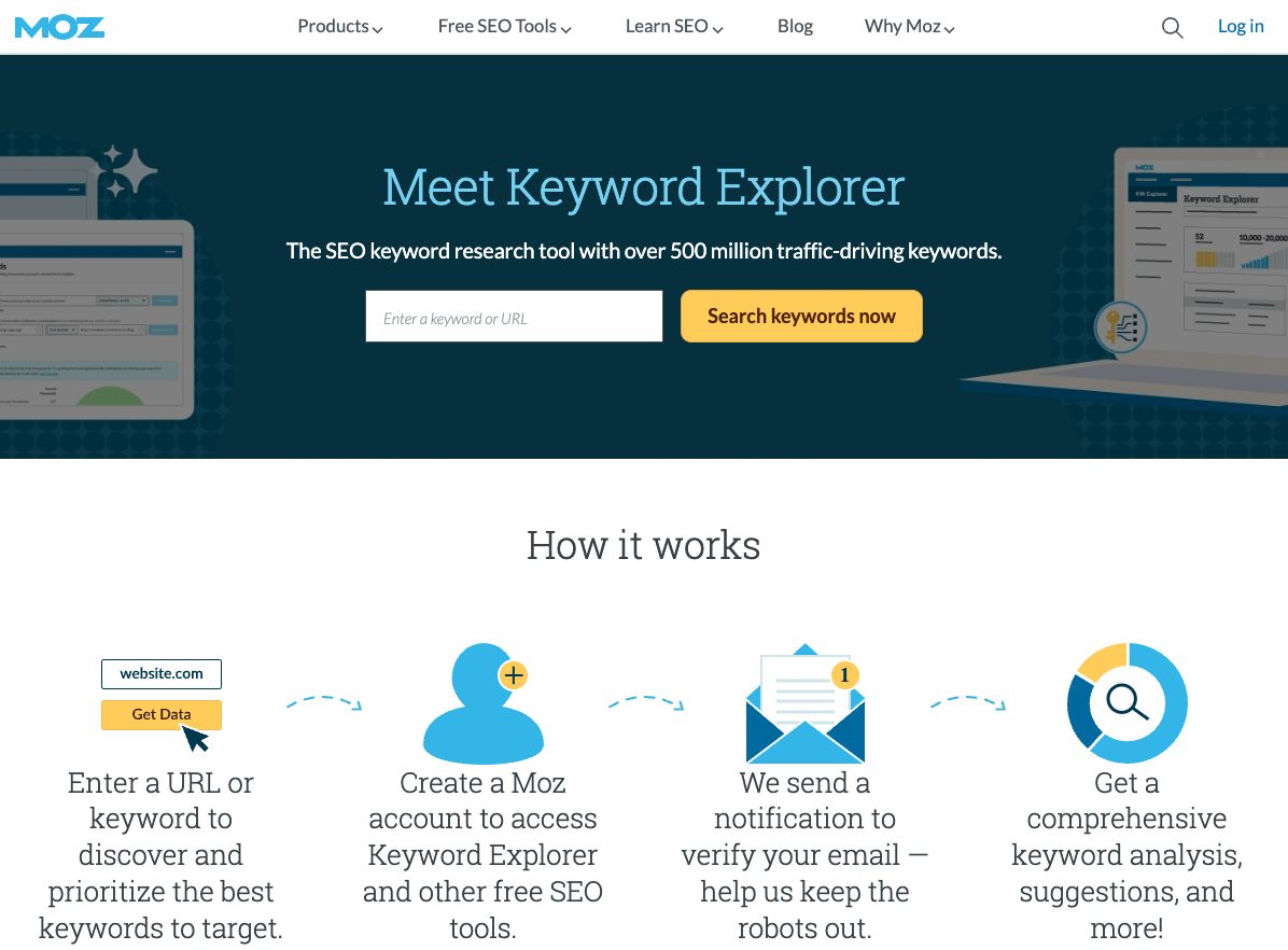
MOZ does something similar—although this brand requires web visitors to create a free account to access the feature.
Source: moz.com
And, sure, this is a great tactic to improve lead generation you could implement on your website. But it’s not a strategy anyone can pull off, as it requires a high level of customer trust, which MOZ enjoys due to its high level of industry authority.
6. A product explainer video
If you’re looking to engage site visitors the moment they land on your website, you might want to experiment with video.
According to a 2021 Wyzowl survey, video is a successful format for increasing dwell time, boosting product/service understanding, lead generation, and promoting sales. But what’s even more important is that consumers love video more than any other type of content. According to the data, 73% of people would prefer to learn about products and services through video than through text, infographics, ebooks, webinars, or a demo.
Considering this information, adding a product explainer video to the hero section of your website might just allow you to successfully engage (and convert) visitors.
Still, note that there are a few rules to producing successful product explainers:
Keep it short
Research suggests the ideal video length when aiming for engagement is up to 2 minutes.
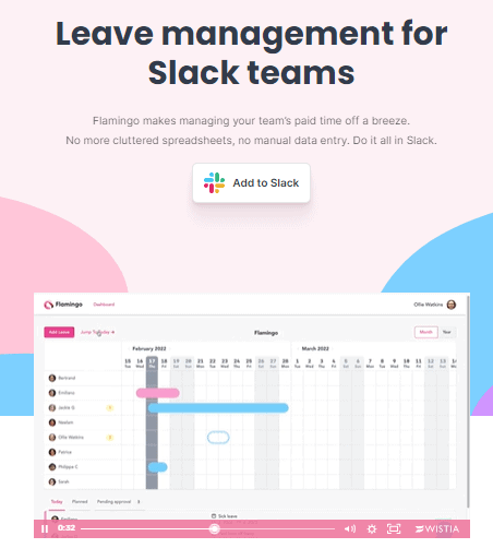
For example, on the Flamingo homepage, the SaaS brand includes a 60-second video below its USP.
Source: helloflamingo.com
This tactic allows the business to provide web visitors with an in-depth preview of what the app can do without forcing them to read through blocks of text or sit through a presentation that never ends.
Be true to your brand’s voice
Don’t try to be witty or friendly if that’s not what your audience expects from your business.
Be clear and concise
Although jargon use can position you as an expert, it defeats the purpose of the explainer as it instantly makes it less likely that viewers will understand what you’re talking about.
Use graphics, animation, or images to boost understanding
If you’re selling a complex solution, don’t rely on your audience’s imagination to explain what it does.
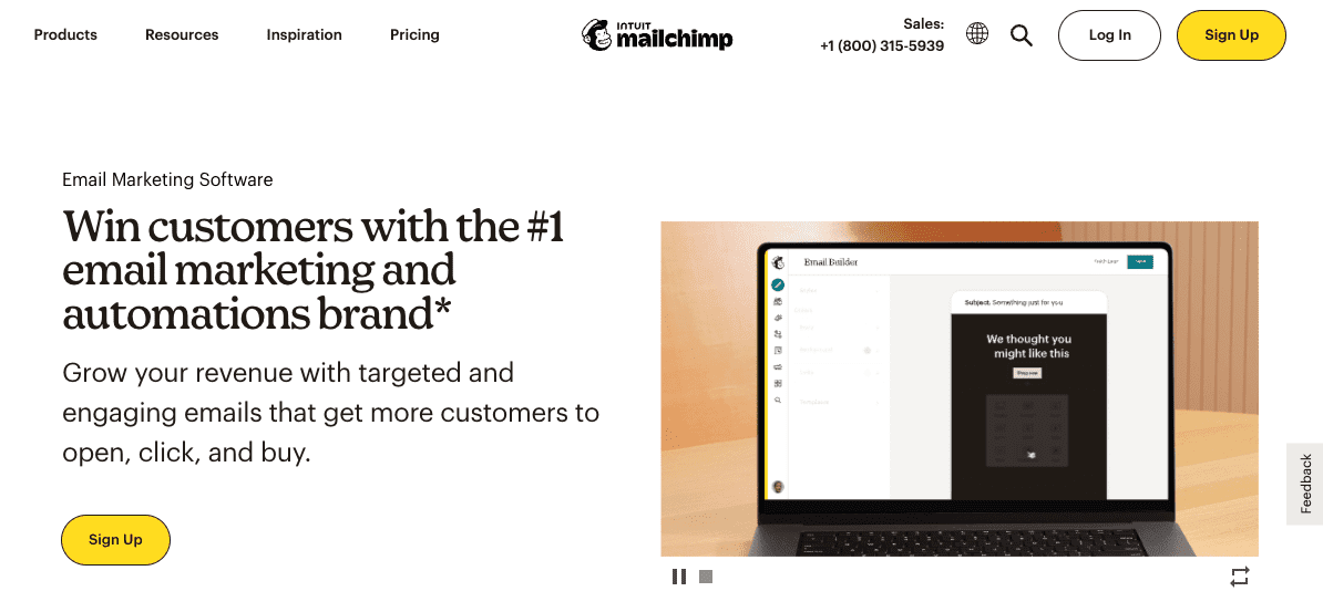
For example, Mailchimp’s 3-second screen recording makes it super-clear how easy it is to create an email campaign with the brand’s editor software.
Source: mailchimp.com
Play around with storytelling and emotional marketing
In some cases, your prospects won’t be as interested in features as they will be in the commitment of your company to solve their pain points. Show that you understand them, either through storytelling or by directly addressing their frustration over an issue they’re experiencing.
For instance, check out how Asana uses this tactic to make its homepage explainer video more relatable, knowing that people are guaranteed to recognize their pain points in a depiction of a man trying to juggle remote work with being a parent.
Source: asana.com
7. Credibility signals
In certain sectors—like health or finance—the most important thing you will want to do in the above-the-fold section of your website is to establish your brand’s credibility.
After all, if almost 60% of people are inclined to distrust organizations until proven wrong, it’s easy to see how your conversion rate might suffer if you fail to establish your business’s trustworthiness.
To build credibility, showcase any necessary accreditation or guarantee and ensure your future customers understand they can place their trust in you without having to worry about the quality of service they’ll be getting.
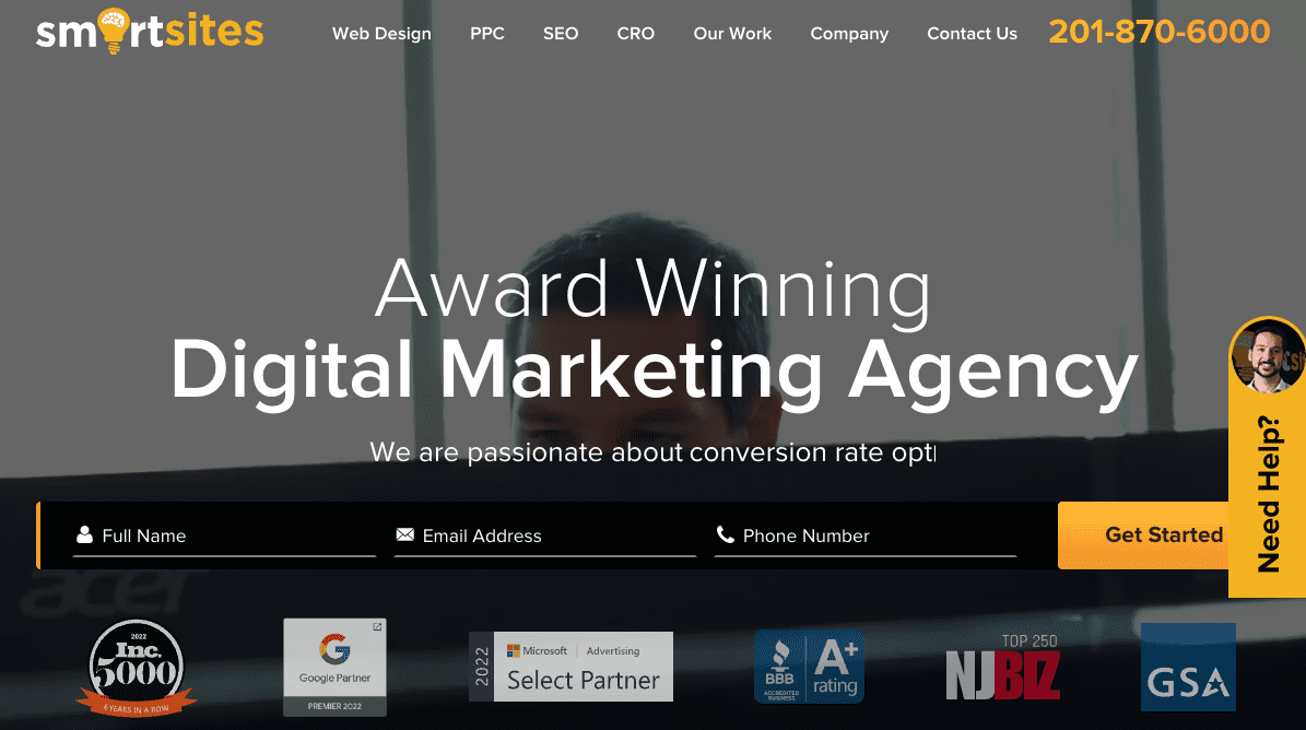
For instance, something as simple as showing off relevant recognitions, as done by SmartSites, can be enough to convince your audience they can rely on you to deliver results.
Source: smartsites.com
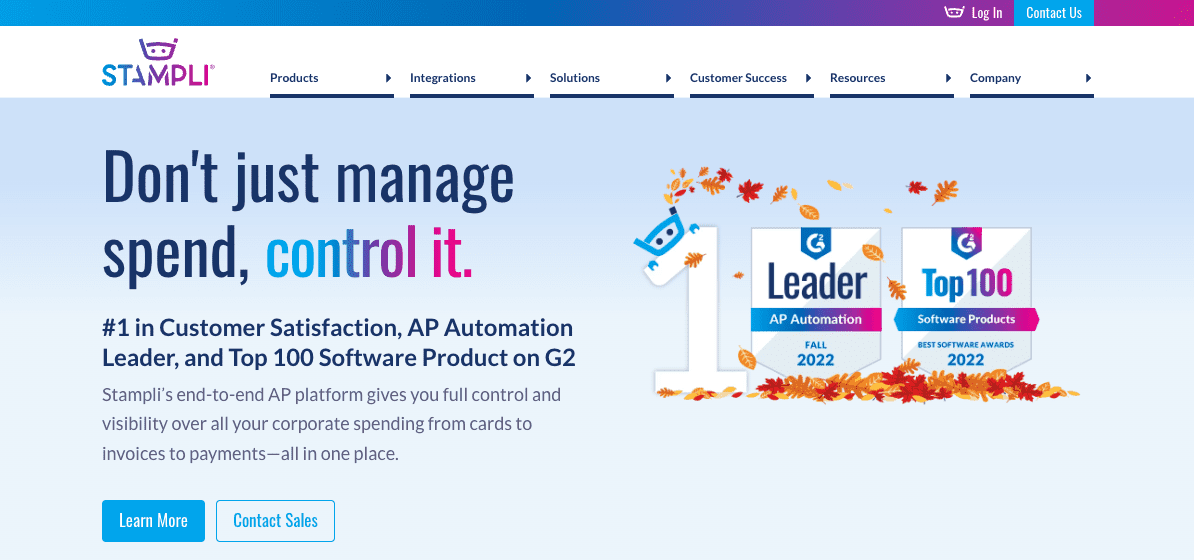
Or, if you really want to emphasize your brand’s dedication to delivering a superior product, you might even want to do something similar to Stampli, which replaces its hero image with its G2 Leader and Top 100 award badges.
Source: stampli.com
8. Social proof
Finally, as you explore above-the-fold design tactics that will boost site engagement (and help you convert more customers), don’t forget about the tremendously positive impact of social proof.
After all, people trust the opinions and advice of others—especially when they’re making purchasing decisions they don’t feel competent to make.
So why not capitalize on this early on in your audience’s buyer journey, capture their attention with positive social proof, and ensure they form a perception that your brand is not just a business they can trust but a highly competent organization as well?
There are dozens of ways to make social proof an integral part of your website’s hero section.
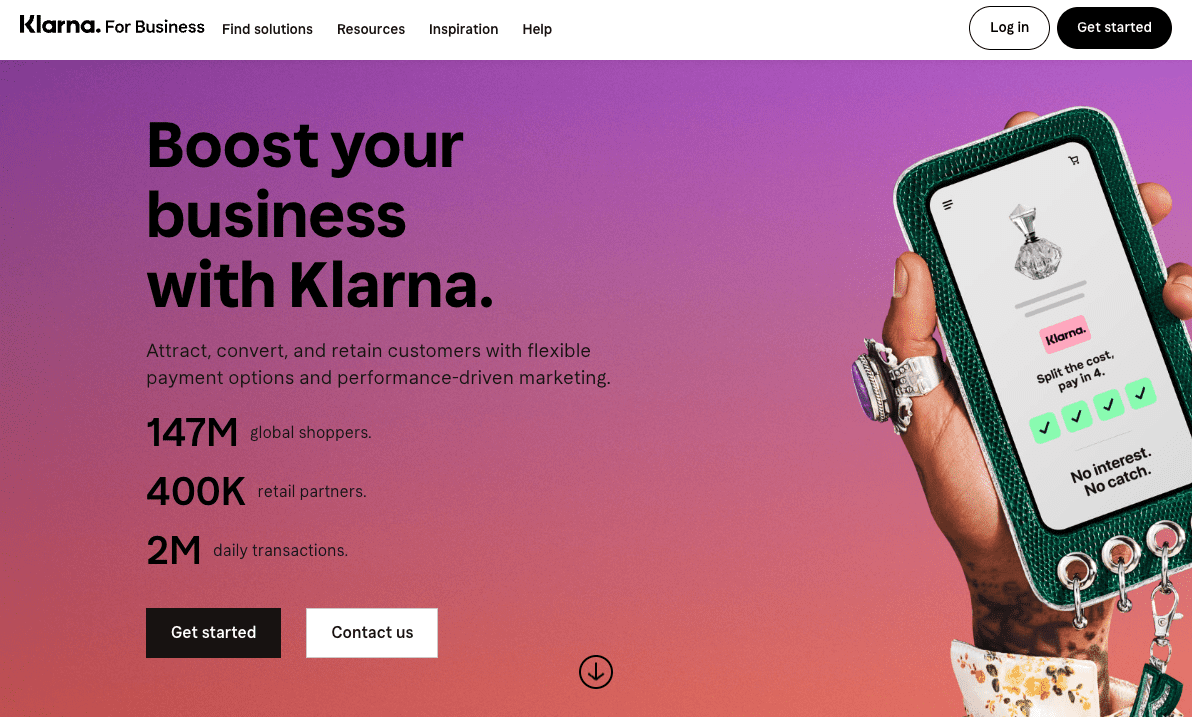
Show off media mentions from publications your audience trusts. Communicate your value proposition by telling a customer story. Display ratings and figures that testify to your user base’s satisfaction, as done by Klarna.
Source: klarna.com
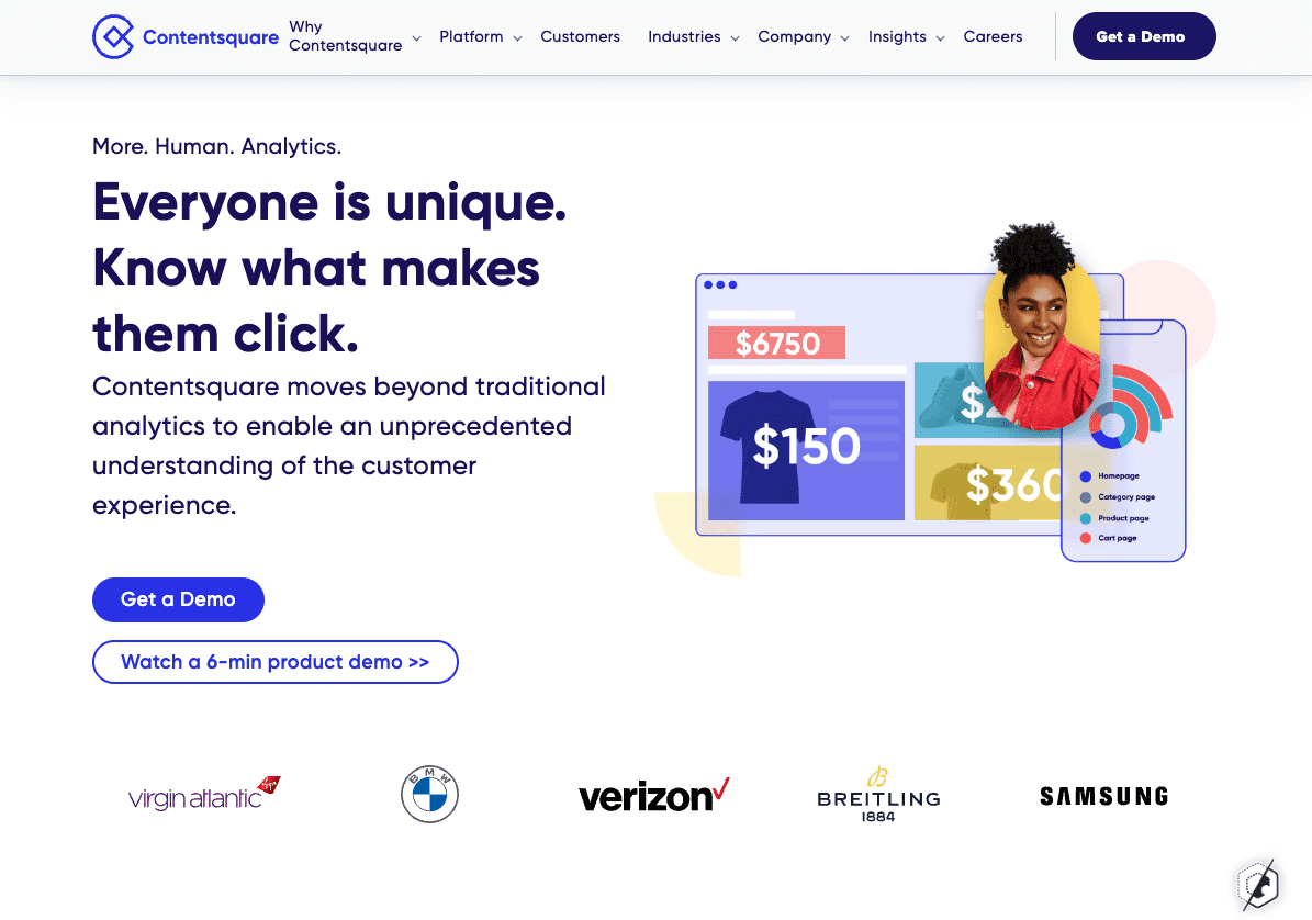
Or, knowing that your audience is most likely to trust their peers, point out who your successful clients are, as done by Contentsquare.
Source: contentsquare.com
Optimize website above-the-fold for engagement and conversion
There are many ways to engage site visitors by employing different above-the-fold design tactics.
But, as you start experimenting with elements to include in the topmost section of your website, don’t be tempted to do everything at once. This is more likely to cause confusion than benefit your conversion rates.
Instead, define the goals you want to achieve on your website and incorporate strategies that will allow you to accomplish them. Doing just one of the things from this list can be more than enough to double your ROI. So don’t sabotage your potential gains by trying to bite off more than you objectively need.
