Easily Design FB Ads with Jeir Lazo, AppSumo’s Creative Lead [Tutorial]
Ever wondered how to automate your graphic design process? We sat down with Jeir Lazo, our creative lead, to walk you through how to design FB ads that convert.
Level up your digital marketing with our best tips for freelancers and agencies. Download Now
If you’ve had to design FB ads yourself, you’ve definitely wondered, “How in the heck do I automate my graphic design process”?
(Cue the robots coming over the hill, taking all the graphic design jobs by force.)
Ok, no. Not like that.
But there is a tool that speeds up your cross-channel ad design process by up to 90%. It’s called RelayThat. From Pinterest posts to Facebook ads, RelayThat helps you create compelling business graphics insanely fast.
Unfortunately, a great graphic design tool does not a final product make—but tutorials can help with that.
Grab an exclusive lifetime deal on RelayThat — Starting at just $49 $1200 (limited time)
We sat down with AppSumo’s Creative Lead, Jeir, to show you how to easily design FB ads fast.
A bit about Jeir: he’s worked at LiveNation, House of Blues, operated his own ecommerce company, transitioned to a digital marketing agency where he was head of design for several multi-million dollar companies. Some of the biggest brands he’s worked with include HomeChef, YogaClub, FabKids, and now AppSumo.
Jeir uses RelayThat every day to make banner ads, Facebook ads, and cover images for AppSumo.
When we polled the Sumo-lings on this webinar:
- 70% had run Facebook ads before
- 50% hadn’t used RelayThat, 40% had some experience, 10% were regular users
- 50% were founders doing it all, 21% digital agency, 20% general marketing/advertising, and 10% were in-house designers
For this post, we’re solely focused on ad creative. If you’re looking for how to configure Facebook ads manager, check out the webinar Jeir mentions: Optimize and Design FB Ads Right Now with Jack Paxton. You can also read our takeaways from that webinar, here.
Here we go:
- Design principles and best practices (why creative is important)
- Tutorial: How to Create Ads on RelayThat
- Passing the Facebook text overlay test
1. Design principles and best practices
Creative is king
When it comes to advertisements, creative matters a lot. Studies have shown that “56% of a brand’s sales lift from digital advertising can be attributed to high-quality creative.” (source, source)
In July 2019, Facebook shortened the primary text that can accompany ads: from 7 lines down to 3 lines of text.
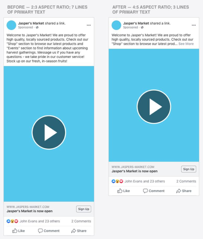
(source)
Plus, text can only cover 20% of your total ad space (more on this below!). So this puts even more importance on creative when it comes to successful Facebook ads.
As you start to plan out your creative strategy, Jeir suggests starting with the question: How can I create a pattern interrupt in the social media feed? Or to put it another way: if everyone’s scrolling down, how can you get them to stop and scroll back up?

Preparation
Start by taking a high-quality headshot to humanize your ads account and make a connection with your audience.

Jeir, leading by example
Jeir: “You need to step outside that box and be more comfortable with your audience. So take a headshot. It’s always important to have a human touch on your Facebook ads—cause we’re designed that way, to interact one face to another.”
Once you have the right photo, use Remove.bg or Adobe Photoshop to remove the background. This clean photo of you can be used across hundreds of graphics to humanize your ads, build trust, and highlight the face of your brand.
2. Tutorial: How to Create Ads on RelayThat
Essentially, RelayThat is a tool for setting up a whole suite of ads in just 10-20 minutes.
Once you create a workspace, RelayThat automatically generates hundreds of different layouts so you can get started with the type of creative that you want.
Once you add your brand assets into a “workspace,” you can click “ads” and instantly see hundreds of graphic options. Click an option and scroll down to see other designs and dimensions for cross-channel ad creation.
Jeir goes through:
- For FB ads, he uses 1200 x 1200 dimensions for that 1×1 ratio
- Using the NEW grid button so you can make sure text only fills 20% of the ad (e.g. in a 5×5 grid, taking up 20% of the space = max. 5 boxes)
- Including CTAs—sometimes FB doesn’t count them. But sometimes you don’t want the CTA in the image because it will appear elsewhere.
- Magic import: add a URL and auto-import brand elements (colors, images, logo, copy)
More Design Tips
Use contrasting colors to highlight important elements and create a visual hierarchy in the design (example: bright background, white highlight behind text to make it pop)
Consider photography’s Rule of Thirds to help with the composition of your ad. Place the most important elements of your ad where the lines intersect.

Add visual cues to help direct eye movement (See how the text points to Jeir’s eyes and vice versa? This is a visual cue to signal where people should direct their attention.)
(Looking for a grid to help you analyze your ads? Check out Jeir’s downloadable grids.)
Typography
Your goal is to have the audience digest information quickly and easily.
- Left alignment increases readability
- Avoid extremely thin/bold fonts for readability
- F-Pattern — The vast majority of users view the left side of the screen more than the right and read in an F-shape
3. Passing the Facebook text overlay test
While you can use the grid feature in RelayThat to make sure your text only fills 20% of the squares (AKA 5 squares), he also recommends checking images with Facebook’s Text Overlay Tool.
But like all rules, this rule is meant to be broken. There are a couple ways to get creative with text placements in your ads.
These strategies do not guarantee that your ad will pass. But here’s some tactics to consider when creating ads:
1. Place images on a screen (laptop, notebook, mobile device). Facebook’s AI doesn’t seem to penalize you for text in these kinds of graphics (at least as of now).

2. Angle texts — Facebooks’s AI doesn’t seem to penalize text when it’s at an angle.

3. Sometimes Facebook will not pass your ad if there are high contrast designs in your ad! Facebook AI will assume it’s “text” because of the harsh lines.
—
Craig, Founder of RelayThat: “If I had one piece of advice for people: keep your images really clean with a clear call to action, a complementary color scheme for the channel you’re running it on, and use RelayThat to create lots of different graphics to A/B test. A lot of people make an assumption about what their audience wants without testing.” (Watch the last 15 minutes of the full webinar to hear from him!)
What will you do with RelayThat? 👇 Hit us up below 👇
